Level 3 DDA Year 2
Grace Cheung
Redesign/Motion Graphics (small business's logo)
This is the project of redesign or make a motion graphics for small business logo, I had to decide which part I had to done for the small business logo, one of my weakness was reaching out to some small business for take a commission for redesign or make a motion graphics for their logo, so I take a moment for make a post on my art accounts for making people to take commission for free service of redesign, design or making motion graphics from the logo.
It was supposed to in the Progression page, but it was a big project with me request a couple of businesses on social media or email with the making of motion graphics or logo redesign.
Messaging to small businesses
The finding of small businesses were quite hard for me since most of the logo design was too great for a redesign or a bit hard for finding a recent businesses that were small and unnoticed online. So I figure out around the map for which restaurant, cafe, bar, or bakery for requesting to make a logo design or motion graphics.

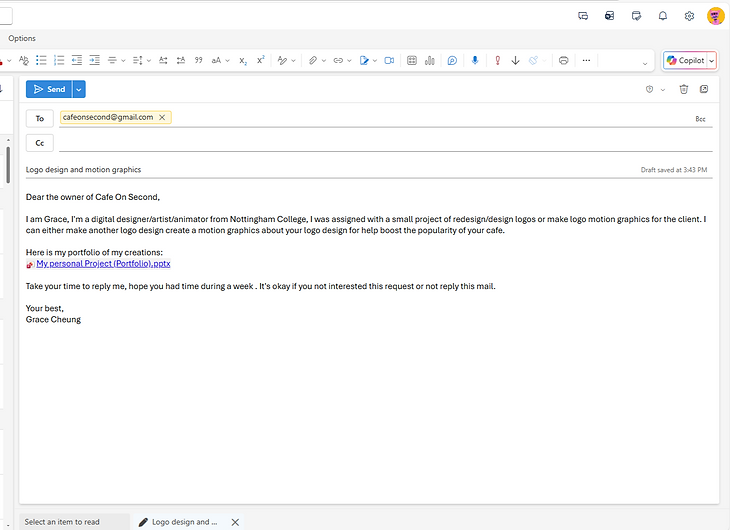
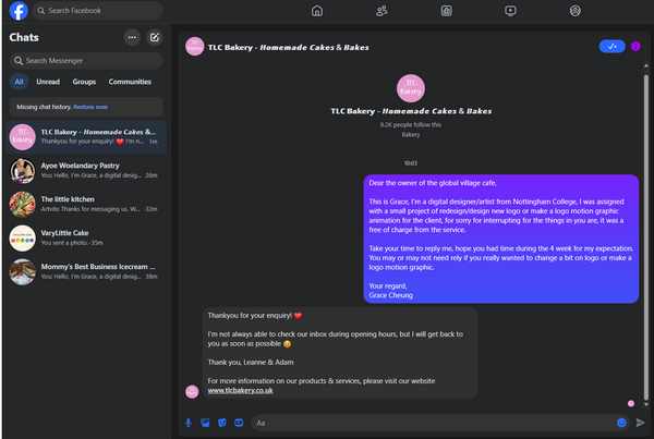
The cafe was from a small town in Australia, it had an interesting logo that can either be redesign or make a motion graphic of from the coffee cup and the text. I had send the gmail that I had written on the whiteboard about "finding a client", I did had some changes for something that was appropriate and approachable. I also added the offer of make a motion graphics out from the business's logo for them to decided the either the project I had to done.


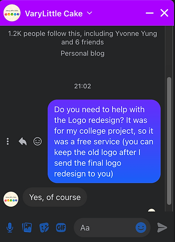
The only business I was connected with was VaryLittleCake, and I texted the owner of the business for making a motion graphic out from the logo on Instagram since the email for her was a bit harder for reach her, I also know the social media accounts were active for the orders from the clients. So it was lead me to ask for wanting to make a motion graphic of the logo, it will be a bit complicated when it needed for a traditional look of the logo design.
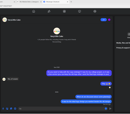
I also leave a message for approaching on the logo redesign if she wanted to, I had mentioned that she can keep the logo after I redesign the logo for testing out for something new. Where I change to Facebook for better communications, also the reason she always active on there; I messaged her and she responded that I can do the redesign of the logo, at the same time she can kept the same logo if she wanted to.


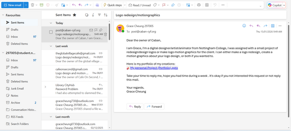
Global Village Café was the last one I had email to request for the logo design or redesign or Logo Motion Graphics, the business was in the UK and it is near in Beeston, there were a website dedicated for the cafe and had some fitting in the cafe theme and how the employees were diverse in any way.

There were other people to text with on Facebook despite their account were either not active for so long, take a bit more time for respond me, or just something that respond for something else that was not related to my question, I don't know how others worked on those business on social media beside VaryLittle Cake which was run by my mother.
Now I had the time for focused on the tidying up what I had left for VaryLittle Cake's logo redesign which I had receive an approval from her at Sunday, I also talked about which design was the best for her branding.
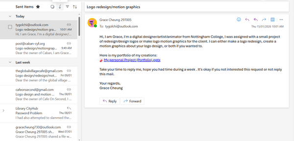

These were more messages for different businesses by Facebook messanger and Outlook mail, I had waited quite a while for them to respond the messages to get my offer for my other doing besides VaryLittle Cake, it is what to felt like as a freelance artist/designer... under appreciations from the public. Some of them responded for respond it soon, which takes weeks for them to responds my offer for a free service for once.
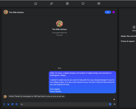
I found one account that the logo feels a bit off for a classic pastry design, so I messaged the person behind the account for the free service for the
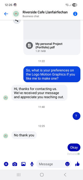
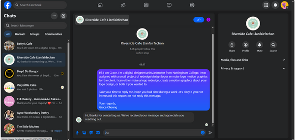
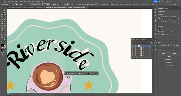
I the shift back to the business of Riverside Cafe, they had rejected the idea from me to make a motion graphics on After Effects, I had back up some of the progress I had made for the morning of 21st January 2026, then I can focused on other client's requests to meet their standards.
It was fine for not accepted from one client, I had thought of finding more other clients I can made to after they had replied me.
Research
Examples

The research of redesigning a pastry logo was how I look out for consistency of how the logo were displayed on the market, I was trying to figure out the directions on not making the logo redesigned like high quality refine dining cafe, and more focused on hand-made pastry and have the small cozy feeling that was made from a mother.
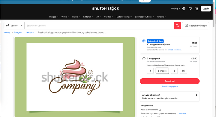
As the ideas of the logo design, I mainly reference some cake that sliced open and had the slight lift, I also wanted to approach on dealing with the cake designs of the cakes VaryLittle Cake had made as references for the logo. Than I found the one that caught my eye, which was the fresh cake logo vector graphics, it was clean and mainly focused on the handmade of the cake, the colours were pretty muted and fitting for the grown ups for order the cakes
For research for the motion graphic animation was about the movements of the logos and the effects on different text and shape had change and shift for easier recognising, also with the purpose of the promotions for the brand behind the logo, it also have the fun for experimenting some logo designs and the text in the logo.
The colours were fitting into to motion graphic since it was picked from the official logo and imported into the animation and it helped let the logo getting much more appearing on the simple colour background.
The Hand drawn motion typography was about how the colours and text were animated through hand drawn animation, it took a while for get used to the motion typography for only colours without other animations included in the motion graphics. It was great to present the final result of animation.
One of the motion graphic is references on the Game Boy colour intro, which had the simple introuctions of words from left to right, so I take that as inspirations for the logo of VaryLittle Cake where the circles zoom from close to the original size from the 3D camera to make the 3D effect, also saving lot of time for production in After Effects.
Tutorial motion graphics (After Effect)
This is one of the tutorial for the text's motion graphics on After Effects, as which the logo was made on Illustrator and had to animated on After Effect. It was a step by step tour for how to make a great motion graphics on Adobe software and I need to refreshing some new ideas for the motion graphics.
Cited video link and website
-
Smith, S. by J. and Turner, S. by J. (2025) Global Village Cafe | Bringing people together, Global Village Cafe. Available at: https://www.global-village-cafe.co.uk/ (Accessed: 10 January 2026).
-
Cafe On Second (no date) Google maps. Available at: https://www.google.com/maps/place/Cafe+On+Second/@-25.8432548,148.5632792,17z/data=!3m1!4b1!4m6!3m5!1s0x6bb9cfe8755ab305:0x5ab9d2dde4459db0!8m2!3d-25.8432548!4d148.5658541!16s%2Fg%2F11csrp8y8m?entry=ttu&g_ep=EgoyMDI2MDEwNy4wIKXMDSoKLDEwMDc5MjA3M0gBUAM%3D (Accessed: 10 January 2026).
-
10 Famous Brands as Animated Logos Motion Graphics (2019) YouTube. Available at: https://www.youtube.com/watch?v=HSX4zGnrMwk (Accessed: 10 January 2026).
-
Hand-Drawn Motion Typography [Lyric Video] (2015) YouTube. Available at: https://www.youtube.com/watch?v=OLkg-zn_VmA (Accessed: 10 January 2026).
-
Pro Taper Logo Animation in After Effects | After Effects Tutorial (2024) YouTube. Available at: https://www.youtube.com/watch?v=7Mu3FI6Diq0 (Accessed: 11 January 2026).
-
Pamungkas, A. (no date) Cake logo vector art, icons, and graphics for free download, Vecteezy. Available at: https://www.vecteezy.com/free-vector/cake-logo (Accessed: 14 January 2026).
Logo
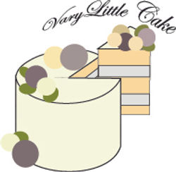
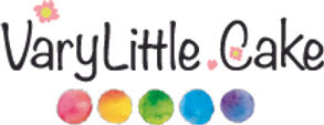
VaryLittleCake
This is the logo I got from was on instagram for edited out on Procreate, which I can make motion graphics on Photoshop and After Effects, I also got the banner from Facebook for easier references on some logo redesign on Illustrator the imported on After Effects file way later. I was planned to do the logo redesign first which was a long way since there were a lot of decitions for redesign or motion graphics on Illustrator and Motion Graphic.
Planning (motion graphics and logo redesign)
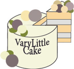
VaryLittleCake

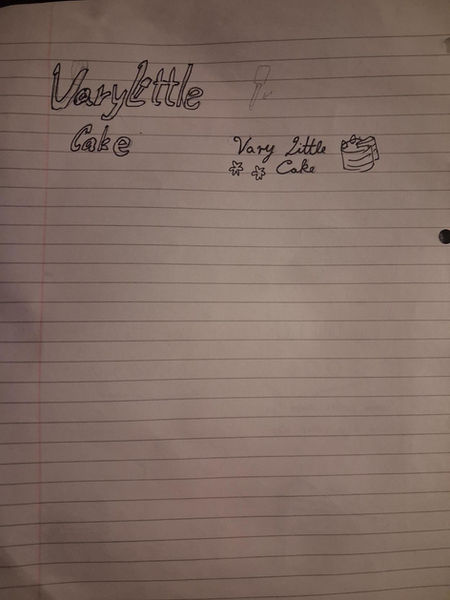
There were a couple of thought of how the make a motion graphic from my mind, and I did not plan the first version of the motion graphic, yet it worked for the end of the day when I proceed to make a simple motion graphic logo on Photoshop. I was later thinking of any new ideas for the motion graphic by draw on the paper for some refreshing.
Which also included the logo redesign at the end of the pages which had an idea for having a cake design and have the different font text for the redesign logo, there were some differences on design and alterations for different fonts.
Progression - Logo Redesign
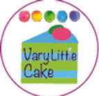
VaryLittleCake
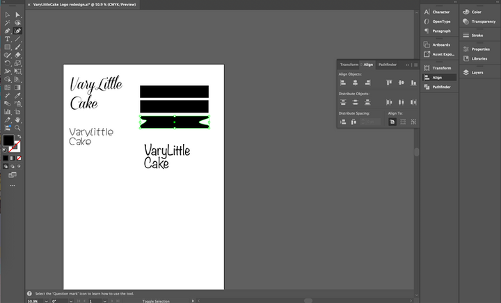
When doing the logo redesign, I started without a guide of what the cake looked like which had some main issue. Result for me stack the shapes like pancakes; I also focused on the darker colours so it was a bit confused to looked at. I was then typed out the letters and duplicated them, I was thinking of three font that was fitting into a pastry logo which was something slight fancy for the design.
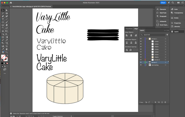
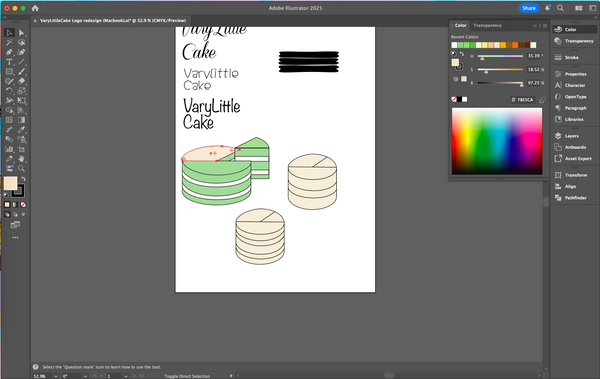
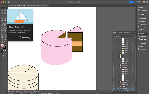
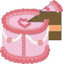
For combining the shapes together, I take my time to find the tool that split and combine certain shapes from pathfinder, this undertakes an hour after I'm not using the Illustrator for a while from now, I stacked the cake like usual and had saparated three different colours for the surface as three different flavour: brown is chocolate, white is earl grey tea, and green is matcha. The icing coating was purely dyed from food dye, so it had more variety of colours. The insides was mainly icing cream
For a moment, I was stuck with the blank cake overall, created an art block because purely for the customisations on the cake itself that VaryLittle Cake had made to the customers. I than remember there was a banner from Facebook that I can based of the design.
After I got the banner as references on the decorations on the cake, I got to work on different customise on the cake design, I also discovering the smoothness of the drawing pen setting to make a smooth line when drawn out on Illustration, so I made some changes on some cake design with the new discoveries.
It was a bit hard to focused when dealing with the ideas of cake design when there is a banner at the background, but I had done some great work for the logo design on Illustrator.
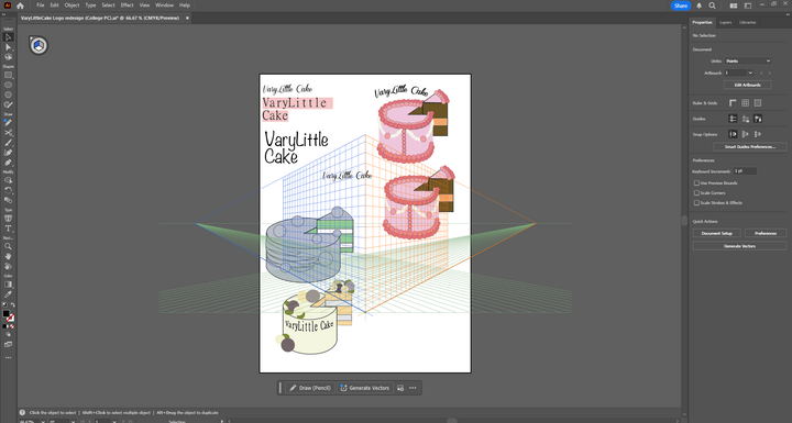
There were a bit of subtle changes every time for different result on the logo redesign, I had some font for testing with the arc effect for each logo design, I also did send the recent designs I had done to the cilent for choose and talked when I back home. At most of the designs were rejected because these were too complicated and it only serves a singular cake which was not great for the audiences that she is targeting.
After replies and discussions

After the discussion with the client face to face, I bring myself to work on some changes for the logo with a more approach on simple design, I figured that will be a simple from having some small additional things around the basic logo that was already perfect to the business model. I then added the basic designs for the logo like adding pastry tools or some flowers around or behind the text logo, I also not attempt for over-design the logo.
I had another idea that drawn on the sketches at the start of planning which was the flowers at around the logo, I done a small flower designs by simply drawn with the pen tool then duplicated for the that were on the whole point of being a bit decorative on the logo aside from the cake design overall when given to the customers for better impressions when looked at the logo.
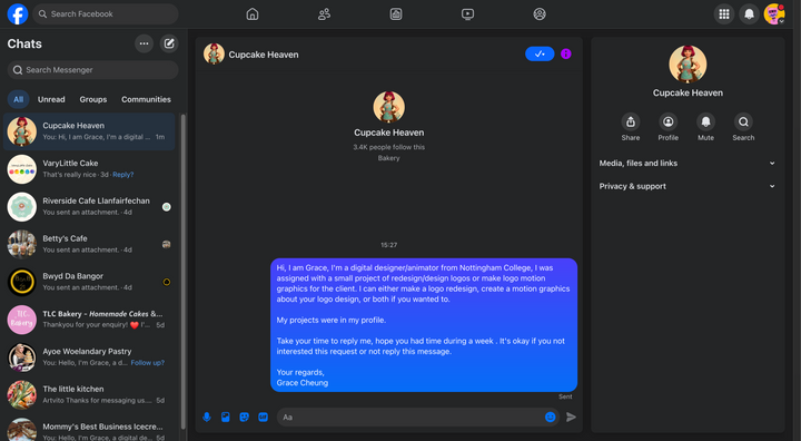
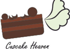
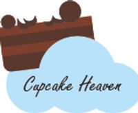
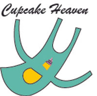
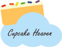
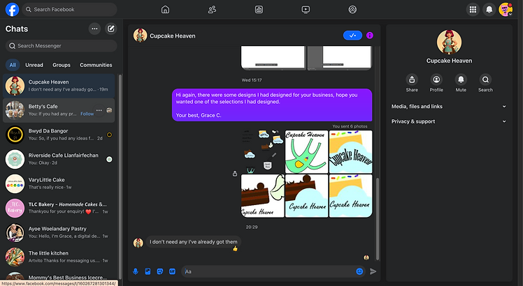
Cupcake Heaven


Despite she is not responded yet for which one was the best, I had to started to deal with the basic overall for the logo design with simple outline and colours from the things she had made and post on Facebook, I also made an apron for the logo for easier understands for her logo brand, so I got the easier choice for the apron design with the cupcake at the centre.
I created for the simple logo design as like it was from heaven, so I had added wings or put the cake in the clouds for symbol of the logo, and had the time to proceed some colour variations for the logo for better choice for the client.
Progression - Motion Graphic
VaryLittleCake
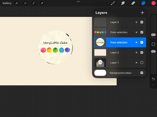

There are ideas for different motion graphics that need to animate on Photoshop and After Effects, which had some differences on the app itself, so I use Procreate app where I can get to separate the logo into different layer for easier animate. It was a great plan for animate on Photoshop and After Effects.
Then I drew some cupcake holder for making a cupcake vibe for the motion graphic animation I can later made on Photoshop, and the cake was the stretched version of the balls that wee at the logo, but I did not use the cake after uploaded from Procreate file to Photoshop file.
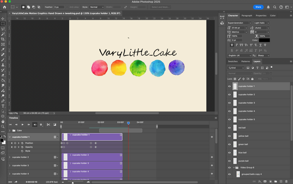
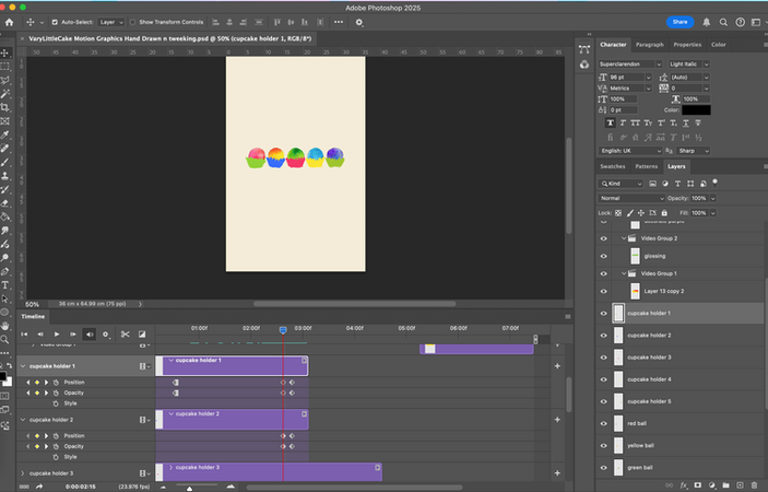
After transition from Procreate to Photoshop file, I make changes on the canvas overall to became a vertical canvas for easier to getting the logo at the centre, also it was how the logo motion graphics were portrayed in social media. I then figuring out the basic animation tween as possible on the motion graphics since I had not yet figure out the actual idea for some new idea of motion graphics on After Effects.
The cupcake holder was cropped from the rectangle shape lesser tool to make all five of them balanced; Then, I edited a little to make it better, I then have shift on the centre of the motion graphics for focused point to the audiences.


At the start of the production of motion graphics on After Effects, I got all of the animations in one compositions that complete 30 seconds of animation. Then, I organised based off the storyboard I had planned from the start, adding different parts into animations, then proceed to tested out.
I was then figured with the 3D camera to easier to me to adjust the placements to the z-axis of a 2D animation on After Effects, the rotation was also useful one part where the cake just on screen. At the middle of the animating on After Effects, I had a new idea to made on the same composition, and without wasting anytime, I continue to making the animation at the end of the composition.
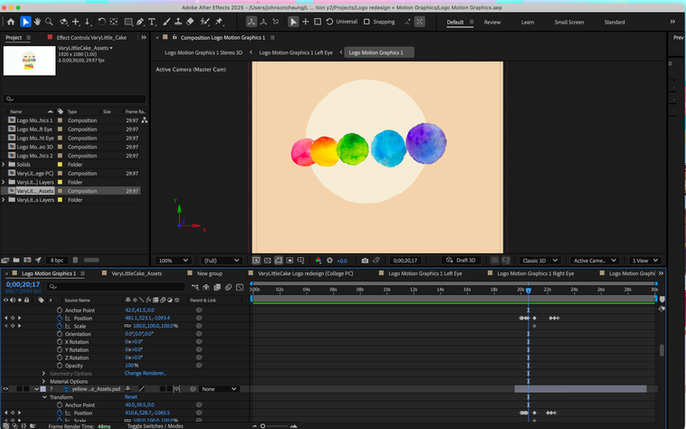
Overall, I got the animation done that references from the GAME BOY intro, so I had the simple idea for putting what was originated from the logo and animate within the minute, even thought it lasted only 5 seconds for the animation, it felt right after testing it out or the animation when exported.
This whole feeling of relief of finish the animations felt great and relaxed since it was done before I expected on the deadline of the project.
Riverside Cafe Llanfairfechan
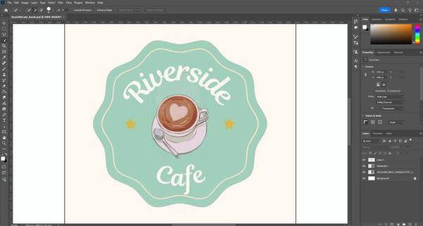
This was supposed for making a motion graphics out from the logo of Riverside Cafe, I mainly focused on the appearances of the logo's introductions on Illustrator and have the colour a bit brighter from the original logo, it is better appealed to people, the text were need to shaped after the font that was similar to the logo's font.
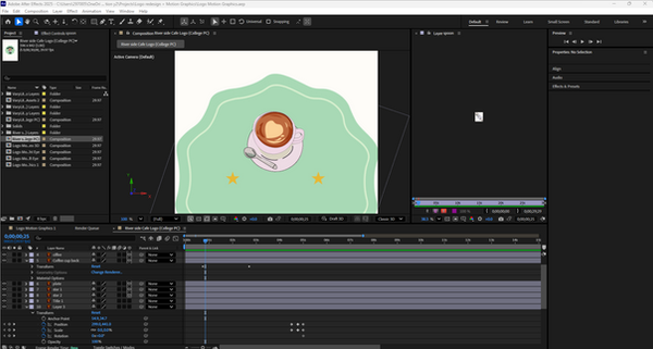
I the uploaded on a different sections of the animation and start the production of the motion graphic, I was planning for the logo background came in first and had the illustration in the middle came later, which was also included water physics within the animation, the text and the props were came last from behind the cup.
But later while I making motion graphic animation on After Effects, the business halted me from progress because they don't need me for making a logo motion graphic animation, which stopped me from produced a small animation.
Result - Logo Redesign
VaryLittleCake
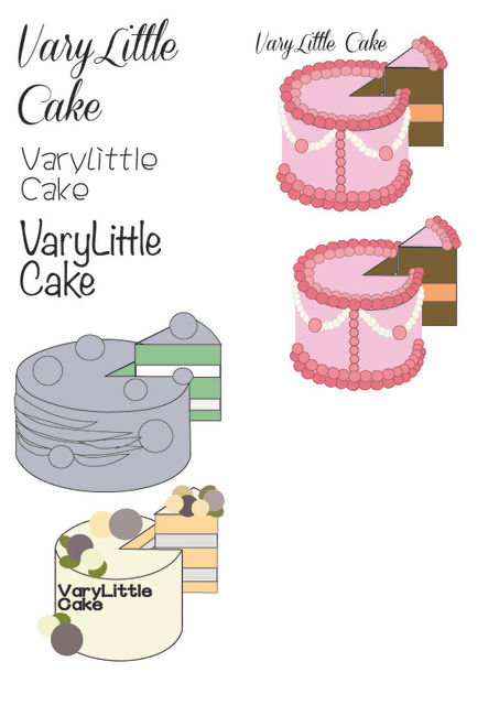

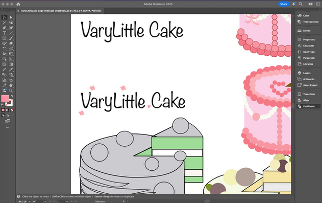
This is the sheet of testing about different fonts and the appearances of the logo redesign or VaryLittle Cake, where I had got most of the references form the banner of the Facebook page. I also focused on the text font for different tests and variants of the logo design. I was wonder how to figured out the best design after all the logo redesign, I than continued with the testing between the overall of the logo design and the text.
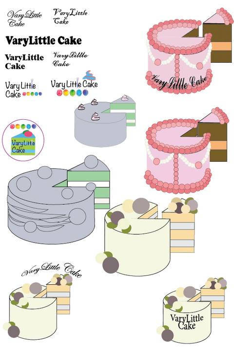
There were more edited I had done for the logo itself, some big, some small, some text were inside or outside the cake. I had loads of option for different design choices and positions. It was fun for doing a whole pages of different logo design, some were made for Motion Graphics on After Effects. I had to tried for simple approach for the logo for easier recognitions and editing on After Effect. Yet had the limited some of the ideas for bringing the cake up as the logo of the business.
It was fun yet stressful for dealing multiple designs at first, but I had manage the outlines and the cutting on the casual point of the cake which had different results every cake.


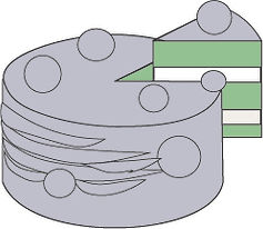


The first two of the example logo was referring to the flower decorations that were done perviously years ago, and it was simplified into smaller circles for easier pattern recognition, and had some variants of shapes and colours that were some not easier to spot due to shadings. The line was a bit thick and it had isolated some purpose on which the customers had the choose, adding it was only the common thing to had backed down for a bit.
These two designs were a bit recycled from the original logo, I changed the font different from the official logo and it was fitting. Then, I was testing for the shaping tool for the logo and the smooth pen on the already great in the outside, the change on the letter "L" to the silicone spatula shape, and adding the whipped cream on top.
My client show this as this is the closest thing I had done, but I had to remove the spatula shape letter and the whipped heavy cream for the next step for editing the logo design.
Overall, these two were the parts of the experiment of letting the logo and the text merged together, it worked not so well on making either of the logos above as the business logo.

These were more varients of the cake design where I can make it into motion graphics on After Effects, with the pink colour usually attract more on the girl side with them to order the cake for birthdays. I also thought of the fact that there were insides with whipped heavy cream in the cake which had grown appeal for the people that there were fillings inside of the cake design outlook.
Despite these logo designs limited some of the customers orders with what I had showed in the logo, but I had tried on different options for creative usages on the logo design in Illustrator besides the circle that the business logo was about.
After replies and discussions
This is the after the discussion for the logo design, so I had reverted back to normal logo and had as minimum as it gets just to had the fun around the designing part on the illustrator, putting something that wasn't too much for the title to read, yet had some additional stuff around the logo design. Despite this isn't the requirement for that, I like that how I can experiment with some other variants of the logo beside the official logo.
Cupcake Heaven
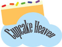
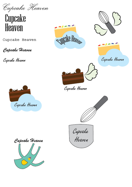
It was a great things I had designed for Cupcake Heaven, despite I am still waiting for their replies, I had already a couple of ideas for the final to how the process has been made for the logo. It mainly based of the heaven that described in the book, also had the
Result - Motion Graphic
VaryLittleCake
Result 1
This first result of the motion graphic animation was a bit underwhelming since it was done on Photoshop and had new ideas for the motion graphics for to be made on After Effects. Overall, I shift the balls from the logo besides the cupacake holder like a cupcake, and I added the effect of fading in as the intro, adding with the blinking motion was for some more animations on Photoshop to make it more lively for me to make.
It was fun to had a simple motion graphics for me to done, by later I had a better logo motion graphics that were done on After Effects which had led to had some big adjustments.
Result 2
The second result was supposed to be at least 30 seconds long, but I cut short to 10 second motion graphics after I had another idea from the same animation I was originally planned. It turns out great for me as the result animation. It felt like having a solid rotations on the cake design from Illustrator and the small fade in and out of the title of the business.
Despite it was a bit glitchy for some part of animation during exporting for the final production for this animation, but I am glad that the production of the animation was finished in two to three days, which had showed the inside of the cake which can give people attentions from that.
Result 3
The third result of the animation was done after based on the GameBoy colour intro, I felt great that I had done for the animation beside the version 2 of motion graphics. It felt short and direct for the 10 second long logo motion graphics, which is the most standard for the motion graphics.
Overall, it is an A+ for me to make a great animation from After Effects with the effects that were give out some of the attentions for the general people to scroll down for an animation ad.
Results to Clients

After all the redesigns or motion graphics, I did sent to the client I was working for and asked their advice and the need of improvement. I only make three of them, and one of them replied before I finish the motion graphics that I can send to them the result, and the rest of the results were sent to the client I was targeted for a redesign or motion graphics.
I felt it was a relief that the results were made to the client that I had messaged, and having some of the interesting things that were on the point on the checklist that the client wanted after for the discussion.
Replies and need of improvement

This was mainly for the face to face discussion for logo design, it was about the logo designs for how I can only for simple designs for the pastry, like the pastry utensil for the logo, or using her logo as based and surrounded with something that was made and design the cake till the final.
For the animation, she can get a pass for that without consider the redo the animation, I also felt right for posting online and sent to her for approval.

There were a couple of rejects from the business for how their logo was just fine or no need for me to make a motion graphic animation. I moved onto some more ideas to be done on the deadline and updating some of the logo design from other client I had right now and give to them for later conversations.
It also includes after I redesign the logo for them just for the rejections, it felt a bit weird which was declined a free service, even thought this would be too good to be true deal as a digital artist/digital designer, but I had accepted my fate after my conversations with them.
Evaluation
At the start of the project of Live Client, I had the need for finding some business in social medias and map, which I had to contacted with the chat option on social media or sent with outlook account to let those business know that I am free for the logo motion graphics or logo redesign if they wanted to. I looked around and find for 11 business on social media and the map, then I sent the exact message to them with the message I typed on the Find a Cilent notes.
There were message of reject or ghosted by them after I sent the proposal to them, but of course, my mom's business let me do it as the last resort for making a motion graphics for her and had some tested out for some redesign for fun because there were some much potential for other designs that she likes it or not.
At the planning, I drew and wrote at one sheet of paper for a decent plan for the animation and the redesign for the logo, I mainly focused on appearances and the effects for the target audiances, I felt confident that the logo may worked after the redesign despite it won't be changing a lot for the original logo. The Motion Graphics animation was mainly on After Effects since there were a couple of animation that can be done easily with After Effects tools.
Firstly, I done the production on Photoshop and Illustrator to tested out the designing and the animate for the logo of VaryLittle Cake, which had a couple of variants for the logo design, and the Photoshop animation was made from Procreate file by saparated the logo into each layers for animating on Photoshop. This was relatively easy for do it myself, yet have to discussion with the client was the important part of making the logo redesign since it only relied on the client's options and opinions besides the personal design on Illustrator.
Secondly, logo motion graphics, it was a bit of work on After Effects and Photoshop, it took around two weeks to thinking and finishing off on time for the animation and evaluating what I had done within After Effects. The first one was made on Photoshop, with the simple introduction of the original logo with the cupcake holder that were from the bottom of the logo in addition. As result, it was a simple animation for finishing on Photoshop. Then I shift to the animations on After Effects, this was for the more effecting animations with the 3D camera and the separated layers from Photoshop and Illustrator, the durations of producing the animation was a week in the two week gap, it was a 20 second in total if it was made into one animation, then I thought of separated the animation into two animations for easier to memorable and had shorten the time spend to make animation.
The Third was for other clients, I planned to make a motion graphics but soon got rejected the idea I pitched to them. Another client I had pitch was rejected after I finished the logo redesign on Illustrator. Which most of the people will rejected the idea for a free service from a college student, it was a few odd chance for someone to accept the pitch and the idea for the logo design or motion graphics.
Overall, it was mainly focused on the motion graphics on After Effects and some designing on Illustrator, it was pretty impressive for make such achieving goals for designing and thinking new ways to figure what the design that can target on the audiances. The need of improvement was the communications with people, and sometimes just a need to text a bit more for letting them know about to make progress on the design and talked about that. It also let me to testing the surface level of communications through online, despite there are needs to a face to face communications that were needed to be improve in future.