Level 3 DDA Year 2
Grace Cheung
Portfolio + Practical work
Character/logo Design
The task was about taking researches and making example about character designs and logo designs' silicide, which was research based task where I had to found a character design and a logo design respectfully for how their design were recognized as close up at the same time far away from the target audience.
Brands

Some luxury brand use fonts and classy shapes to matching their brand. For example, Louis Vuitton, which their logo design was designed in more class, comfort, grandeur and luxury to their intended audiences where more lean into a higher class who wanted something to show off.
It also very specific design where everyone knows this is about a luxury fashion brand. At the same time attract people to invest on luxury brand for its high quality things in the store itself.

The fast food or brands were prominent for using red color to attract people to stop and let them notice very far away, and Pepsi was no exceptions for having red at its logo itself where can capture anyone who crave fizzy drinks.
There were other colour red, white and blue for let the brand obvious selection compare to other fizzy drink brand, and create the feel of patriotism for the marketing and the audience.
Character design
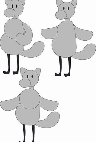
Character designs was one of the important things for a story in graphics books, mangas, animations, and video games, which their silhouette were needed to be capable to be recognised from a short or far distances or from the crowd. And the shapes are also important when develop a character design, which build up their personality and their story.
Additionally, there were simple designed characters and complicate designed characters across all media, which all the designs were depends on which target audiences and what kind of character designs for the designers needed to design during production.
Simple Character design

Often the simple designed characters from media that target on younger audiences, the designers tend to focused on simple shapes and friendly approach to the younger audiences, even though there are sure some character designs were intended to be more intimidating or cool to the younger audiences, but the designs were supposed to stick on specific style in the show/video games/ graphics books.
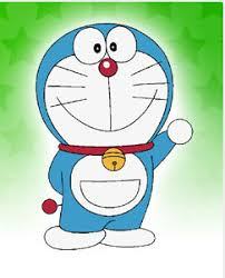
The first example Gravity Falls which has a couple of rounder design for matching the theme itself, at the same time, there were some of the hidden shapes that helped to solidify the specific characters that can stand out from one another through the entire series. The second example was Doraemon, which all the main casts' designs were focused on rounder appearances on certain parts on their whole body for getting in touch on the young audiences; simple shapes were also came with simple colour that weren't too bright nor badge.
Complex Character design


There were examples of complicate character design that were exist in media, where it existing more prominent on 12+ media, where people can focused on the detail of the characters, which to their silhouettes can be easier to recognised to the older audiences. Additionally, complex character designs were mainly focused on either character's backstory or personality.
One of the example that I recently looked at was "Date Everything" which is an indie game, as the character designs were scattered on different shapes and sizes on each of their design, including some small and unique detail in each design aspects depends on certain concepts or objects; as result the silhouettes were easier to recognised for how much unique designs without any mixed up in different characters. The character designs are made the game not just targeted on a certain group of people, it placed the game for larger group of people around 17+.
Source
Official Date Everything! Wiki (2025) Characters, Date Everything Wiki. Available at: https://dateeverything.wiki.gg/wiki/Characters (Accessed: 10 September 2025).
Illustrator practice
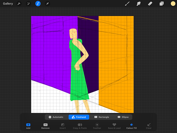
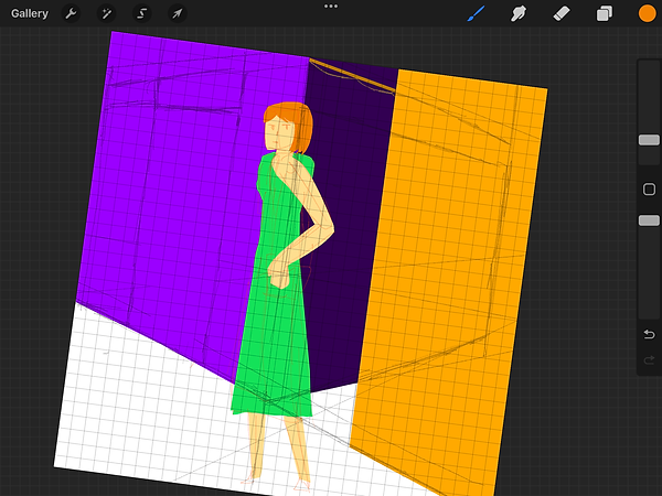
There are some practicing on Illustrator with the shapes and the pen tools that were useful for designing any simple character design or a logo design, as the start, I had to made a grey silhouette to how easy the character was recognised from far away than finalised when the shape was done.
The idea was design a character sheet for a simple cartoon character, the character was based off a otter and a plushie, which had approach on a friendly side to a younger audiences.
Progression


At the start of doing the small task of my own, I focused on the shape of the character by using the circle tool to make the outline of the character, where he was more lean towards a friendly characteristics and more softer looking like Winnie the pooh, later I use the pen tool to tweaking the small shapes of the character till I can see the character's silhouette.
Beside that, I was planned to design another character but I focused more on one character instead to easier to maintain for one character sheet of how I change on something different each time I change my mind on some minor detail.
Yet getting some of the simple shape on the right in place was a hard work to do to retain the character's silhouette. Gave me a little more time than I expected when dealing with shape tool and shape adjustments.
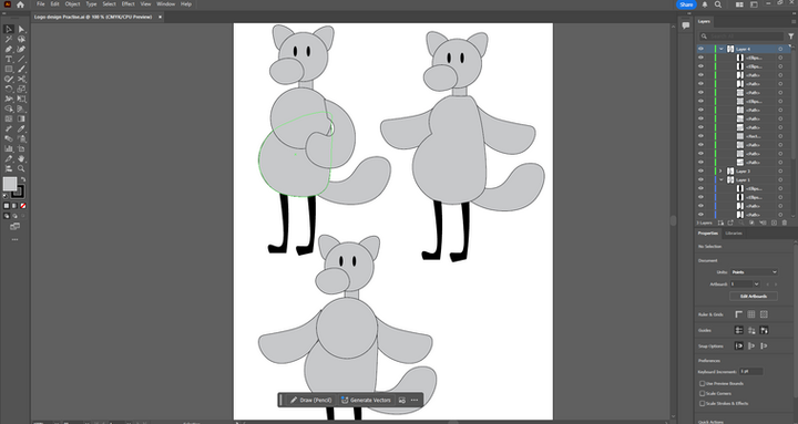
During some finishing off the out look of a character on Illustrator, I focused more on the smaller detail of the character itself. Where I focused on the body and arms of the character, which stated to be round character to be a friendly character itself. At one time, I had to design two part of the body into one, it was not an easy task for how to adjust the whole body from a circular body, but I let myself go on finish the character design.
After all the design, I had done some slight changes on the each version of the character, mainly because it felt off when it looked far away, yet the character was easy to recognised with or without the colours or details of the basic character itself.
Result
As the result, the basic design of the character seem clean and cuddly for the front view, with the 30s cartoonish look of the character that was obvious from far and near. Despite I was planned to colour the character on orange and green as the base colour, the grey colour had reinforced the character on the classic animation with the flat colour choice on the character.
For the mistakes in the design was around the bumps on the arms and the body itself with some edge needed to be edited out and the stomach was more droopy for easier to mimic that 30s Disney animation. But overall, I can recognised the character itself from the far apart or near.


After I put the colour of the character, I felt the character is more alive to be animated because of the colour itself, though there were some issues from the left, I had decided to have some fixing on the body shape to it became a bit flatter to match the physics on how the plushie stands up with the gravity pulling some cotton inside of a plushie. The colour also makes the character felt straight from a cartoon, with simple green and orange main body, which given character the more positive side to the audiences.
Overall, this character design brief can let me revisits on design concepts of how the logos and characters on how they promote on something for intended audiences, it make me felt a needed for knew how the designs work well on either poster designs or animations.
Showreels /Portfolio intro
A showreel intro is about putting all the best things that an animator or a digital artist could do put into one intro for the people. And the showreel was started with the name of the person who was behind all the animation, and the choice of the colour palette and the style of the intro was depends on the animator choice.
And the task was about making the intro of a portfolio of myself, which I needed to be make animation and a motion pictures on introduce myself.
Research
This is the first research about the showreel on defies the creator's dedications and their best work. The animation was smooth at the start of the animation, and there are lots of amazing animation clip in one video, and had the great introduction of the creator for having the certain type of audiences.
Additionally, the audio were from the projects themselves, which shows the amount of dedications on producing on certain animation, with the match with the entire tone of the animation itself.
A small intro of the animation sequence was gone into the depths on 3D animation which given lots of clips with different animation that was made smoothly to let people enjoy and gave it
The intro was simple on sight, given the 3D animation impression to the audiences and some one who checked the creator's profile, additionally, it shows different perspective on different style of 3D animation which overall looked like professionally made.
This animation reel was shows all the personal project from the creator, which had some clips on certain projects that was made over the years till 2023. And the animation had notability improve over the year.
Then the intro of the reel was simple animation of the creator making animation for consistencies and quality of the animation.
As there were no issues for the Portfolio intro for the creator, given all the limitless animations that had done from the creator.
This is the breakdown on a intro animation of a portfolio, it shows all the person's work at the small screens at the back of the main animation itself.
Since it was a brief Portfolio was amazing, yet have some underwhelming performances on introducing on how some of the best project's clip.
This portfolio is a motion graphics for introductions of the creator himself, with some basic information of himself, it contain the simple motion graphics of texts and designs, as he is mainly focused on describe his professional stuff and his interest through the motion graphic animation.
It is a simple and creative way to make a motion graphic animation video for introduce himself, yet a little too common by compare to others' projects.
Source
-
(No date) Color.adobe.com. Available at: https://color.adobe.com/create/color-wheel (Accessed: 10 September 2025).
-
(No date a) YouTube. Available at: https://youtu.be/lHloiXN6mcQ?si=0l-ubSzTroEWkyrK (Accessed: 10 September 2025).
-
(No date a) YouTube. Available at: https://www.youtube.com/watch?v=JUUUqvFbHAU (Accessed: 10 September 2025).
-
(No date a) YouTube. Available at: https://www.youtube.com/watch?v=rx8EhkXk9zs (Accessed: 10 September 2025).
-
(No date a) YouTube. Available at: https://www.youtube.com/watch?v=cpvdUinHR2s (Accessed: 10 September 2025).
Showreel intro
Idea
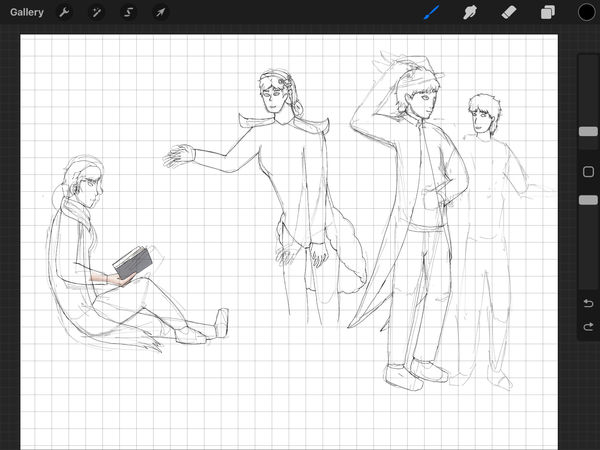
The idea of the portfolio animation was introduced myself with the elements of different style of the characters that I had drew over the years, as the style was mixed between the 60s animation style and “Spiderman: into the verse” style within my animation itself. The characters were scattered throughout the title and had certain small movements that represented their personalities via rigging on After Effects or animated on Procreate.
And to deal with all the animation, I could deal with the animation on After Effects, Photoshops, Procreate and Illustrator. At the start, I sketch out the base pose of the characters on a sketchbook, then later outline all of them on Procreate than transferred on Photoshop for some extra editing. Illustrator will be use for design some basic shape of the characters and texts.
The duration of the animation will be around 10 to 15 seconds because it is the intro of a portfolio where it only last at least 10 seconds for the best.
Brief for Showreel animation
The idea of the showreel animation was introduced to me with the elements of different styles of the characters that I had drawn over the years, as the style was mixed between the 60s animation style and “Spiderman: into the verse” style within my animation itself. The characters were scattered throughout the title and had certain small movements that represented their personalities via rigging on After Effects or animated on Procreate.
And to deal with all the animation, I could deal with the animation on After Effects, Photoshop, Procreate and Illustrator. At the start, I sketch out the base pose of the characters on a sketchbook, then later outline all of them on Procreate and then transfer them to Photoshop for some extra editing or get into After Effects for rigging. It is also along with the number of projects that I have done, from college to personal projects.
All the animations across the animating parts needed to be at 15 fps, not 30 fps, not 18 fps. It is way easier to be animated in such frames per second, and it will be a lot quicker to finish the project as soon as possible. The characters that will appear in the showreel were original characters that I created over the year, and their designs have a story that changed over the years.
Practical work
Colour Palette


There are two colour palettes I need to test when developing an animation, which can be split into two parts of the animation if I had the time, and the animation transition occurs. The colour theory I have chosen is complementary, such as purple and yellow, which I plan to use in opposite colours for different elements in the animation itself.
All the colours can give me the idea to make it easier to introduce myself and my interests, or even use it with a slide show of animated sequences on characters that I have.
Characters + references

When on the character sections, I focused on the characters' appearances within the storyboard till the final Portfolio intro. The characters were my original drawings, which I had created over the years. I planned to sketch them first in my sketchbook and then redraw them in Procreate for easier access when animating in After Effects.
Those characters will be used in the intro of Portfolio and have the style alteration to fit in the current style I am using right now. And there will be some characters that were not created in the past, where I have such a rush on dealing with the brief design of different characters.
I mean, they were the primary reason why I started my interest in drawing, and I have some poster designs or animations that have the common used on them. Which also has the idea of placed them into one Portfolio intro as the additional accessories for how I done all the designs for them and animated them in one place.


All of them had changes over the years; some were overall details or some minor stuff in their appearances, maybe now some characters needed to be added later on in time. I had the general idea of the character design from references.
Sketches

When I started thinking of the idea of how I animate my name, my original idea was a simple pop-out animation with characters that appeared out of the book like they jumped out and became alive in real life. At least I can consider how to animate them on Procreate and then fix them in Photoshop. Additionally, I had planned for how the rest of the Portfolio animation would introduce myself, and it won't work with the original idea for me.
Then, I changed the idea to a full-on slideshow animation with some additional content about me. It may require a lot of preparation, including character designs and elements, to be exported as a Photoshop file for later animation in Adobe Animate. It is a fun idea to dive deeper into introducing myself and creating more character in the slideshow to show my creations.
Storyboard


At the storyboard stage, I began by introducing a character to represent myself, which included some of my other original characters featured in the Portfolio intro animation. I was thinking of how their animation depends on their personality; it adds a layer to my personal style and works somewhere useful.
There were a couple of stages where I had to deleted in the single scene where I had to replaced different things, example were the texts that were written in the storyboard stage was replaced with my projects that I had done personally and in college for showcase that I had done things in my free time beside college work. All the texts were needed to be rearranged to different part of the showreel itself.
For the final idea for the Portfolio intro content with the introduction of my personal favourite interest and professions, also included my name, and the animation is mixed between hand-draw animation and After Effect rigging on the free time and inside of college.
Sketches in Procreate + final design


One part of the elements were some of them were needed to be made on Illustrator for easier shape to be made instead of hand-drawn on Procreate and Photoshop, one of the element is a letter which is simple for made yet the middle wax stamp was a bit complicating to be draw with a pen tool since it is uneven shape as the wax stamp, took a while to finished the basic shape of the wax stamp and some details in the middle. Later, I added editing for the cover of the letter when it flips, as there will be slight differences in the wax stamp on the front and the back. It is then exported into Photoshop to be easier to edit.
In Photoshop, I focused on the entire texture of the mail. This is with a scrap paper image that I used in a couple of other things I had in mind, then I use the multiply effects on the paper to make it translucent a little, then lower down the opacity to 70%. It is an easy task as the whole image only deals with some editing, with the exception that the paper was drawn on Procreate when needed to scale the entire mail itself.
There is similar editing on the rest of the logos of my interests; these were basically only needed to be edited into a paper effect to have the general idea of a scrapbook-based animation in my mind.

All of the characters were mainly drawn on Procreate; it was the easiest choice for me to design a character besides Photoshop to fix some errors and/or make the character assets easier to manage. Firstly, I used the Tridec colour to lay out the base pose, which made it easier to identify which character I was gonna draw in that specific pose.
Then, on the sketching phase, it was in fact some needed management on how I focused on certain placements that I later needed to reconsider, the limbs and the body were the priority because it was the foundations of the characters' general shapes and some other small accents that made the character easier to recognise when the later lineart phase.
At the line art stage, I need to draw out the details from the sketches and separate each character into distinct layers and groups for easier animation later on in After Effects. Each character took at least 20 minutes to complete, and there were errors after their outline, so I had to fix all the errors, big or small. I found myself zooming in and out of the canvas to check for any of the missing parts or any adjustments in every character.
Additionally, there were some manual adjustments made between characters to complete their missing parts within the limited canvas.

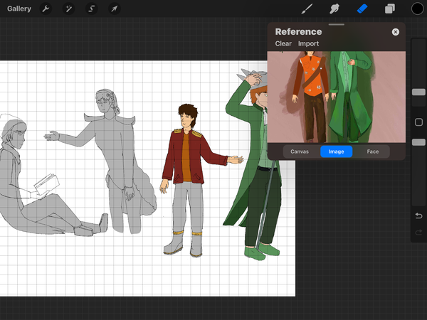
When dealing with the colour of the characters, I first overlay all characters in grey, which makes it easier to choose the actual colours to be overlaid on the grey areas without any issues. I had focused on their colour palette, which was around green, orange and purple (also pink, which was close to purple).
It was a slow process for colouring all the characters, which included their design details. It takes me a while to finish all the base colours of the characters without the shadings and lighting for the character.
As the result of the sheets, I had to kept the characters separated to easier to be edited in individual silhouette from far apart from the editing on After Effects. The colours and some other factor details were greatly effects the characters' appearances in different unique style.
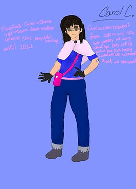
Their relationships were simple, yet their design story has come a long way since 2022. Bruce and Kaylee are twins, and Rosabel is their younger sister. The design behind Bruce and Kaylee was supposed to be Halloween robots (heavily referenced from a jester and a clown), and Rosabel was a replacement of another character whose design was inspired by a purple bear referenced by Helpy from FNAF pizzeria, yet had transitioned from the colour palette and some personality. Never did I think that they would become circus tropes till around.
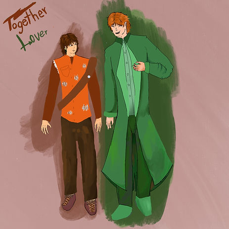
Another character is Luca, and he was added to be Bruce's partner for the Valentine's Day special, having a backstory as a rock musician and a trans-masc character because I was 16 and trying my best to write the best representing for any of the LGBTQ+ in characters, then Luca was later made into part of my character list; his bandmates' character designs were still in development, and how they were settled in. All of them were supposed to be something-based characters, but I never thought they were part of my character list.
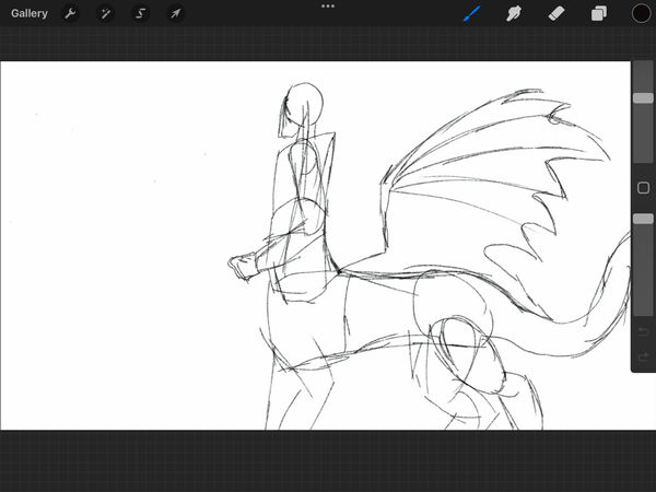

The second asset was supposed to have two characters for easier management at the same time. The first idea, according to the storyboard, involved an MP character and a dragon centaur character on the side to show some personal interest in media. I had planned for the dragon centaur character to have different positions changed over time, but abandoned all the original designs on the side because the right was letting her face sideways, like a wall art in Egypt.
Then I replaced the MP character with myself to make it easier to make an outro of the showreel, maybe having an idea in mind how I stitch and made this showreel with some other interest in the professional skill.

As the final production of the assets, I had to separate even more parts into a couple of layers in a group, the starts were one of the focus where I had to separate from the original layer to three different layers, then I put them into one group for easier getting in After Effects. Then the character that based from myself was a bit easier to manage since I had already get to some usage on the arms only, the only thing that I edited was combine the colours and the respectively layer of outline.
Come with the last part of the dragon centaur character, I edited towards the whole appearances of her and had to separate into 7 sections of a single wing, it contained from joint to joint where I planned to animated on After Effects, it was not fun when filling out the parts where I had separated into pieces.
Animation Production

This is one part of the animation that I have to deal with when the start of the Portfolio intro, and there are a couple of key frames that were taken lot of the time to produced on Procreate, firstly there were the bottom of the character itself since it was the staple shape of him and having to adjust later on Photoshop, which had the legs that were referenced from the simple animations that a starter animator can done that. Then later the details when the character was dangling from the rope so I had to added the rest of the body to scale on the character despite later on I had plans on Photoshop for the easier editing on the arms and the rest of the frames.
As the result of the whole animation was stitched together, I felt glad that I was capable to be finished that kind of animation away before focused on other parts of the Showreel animation, as I was planned to finished off on Photoshop. Overall, it had some distantly great things that I can deal with was about the arms and the body. As I was planned to animated it slightly similar to an old rubber houl style.


After exported the original animation from Procreate to Photoshop, I focused on the whole body movement for "FLAW-E", his body was simple to be animated when in different video layer, and there were some tweaks here and there on the character itself after the base animations that was done on from Procreate. The only struggle was the colouring of the character after realising how long does the entire animation take after managed it into 15 fps, there were lots of frames that needed to coloured for at least a couple seconds of animations, seems like a few seconds but it can take up to days to finished the animation with the colour; as solution, I picked the coloured from the references then coloured behind the character, the reason was to easier to animated and reposition on each major point he moves.
The idea was referenced in some animations that used the character's colour as background on simplified the process of the entire animation itself.
Other important tasks was to covering up some part to make it looked like a finished pieces, there would be some pointed out of how the animations looked unfinished and in a rush.
As there were three different result for the entire animation intro was separated into three different part. The first part was the outline of the animation where I had to felt glad that one thing had done for the entire animations on Procreate than improved on Photoshop that needed to be done by myself. Pretty much that was a bit of rush animations within the colouring of the character, but I am sure that I got the idea from some animation styles that adapted the scrap book and glitching style, basically getting through all the positions in the animations and had some editing for the each frame that I had done for.
This is the edited and finalised version of the intro, there some smaller editing for the colouring for fitting in the outline of the character himself, and I was a bit relief it was only a small fraction of an animation error in the project itself. For caught it sooner or later, it was the right time to fix the animation right there.
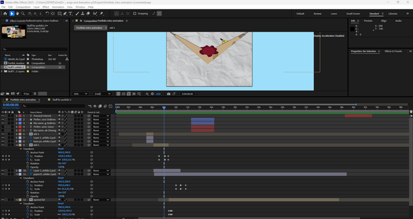

The animation in After Effects was a bit tricky, as it required animating all the assets simultaneously on the same page with other complex assets in the composition. At least positioning is one of the most important ways to keyframe all assets in place on the screen; also there are a couple of managements on the size of the paper itself while transitioning, and the text from normally was using trim path animation, to deciding just animated it like how the paper gets out and zooms towards the scene after the animation of the open mail.
As mention of the opening the mail animation, I had a couple of tweaks on the paper lid itself into two parts where it was closed and open into two different layer, then there was the timing of keyframe the layers were a bit on the position where I had to remain the bottom of the lid stick at the based of the mail while I adjusting the layers.
Then, my concerns were around the timing in the entire animation; there were a couple of animations that needed to be changed after I knew about the showreel and how its speeds needed to be modest to grab everyone's attention for what are my best creations on some animations and mostly artworks and designs that I dedicated during my personal time.


This is where I have to improvise on the entire showreel's timing with correct positioning in the whole video. It takes me a lot of time to decide on and animate the slideshow of artworks and animations, but it is fun to watch the results that reel all the best artworks and animations that I have done.
There were also adjustments to the smaller assets that I drew by myself, and these were an addition to the introduction of the showreel itself. These assets were from different media, and I picked up interests the most where I am still thinking and talking about them through social media. In fact, I added the logos of various media from the beginning to the end of the showreel animation to demonstrate my interest.
Other assets, like the dragon centaur character, have taken me the most time. Different layers together were easier for me to focus mostly on the legs, wings and the entire body, as the rigging of the whole body was some complications for a four-legged species with a body that attached up from the spine, with some random adjustments on the wings as well for the complicatng animation since I had to pin point the basic skeleton of a dragon centaur.
During the export of the showreel animation, I had a slightly different idea of creating a couple of variants of the video itself. At the start of exporting two of the videos, there were some parts I did not notice when exporting the videos twice. For the third time, I added some additional art assets at the start of the intro from the original idea from the storyboard and added some artworks in the middle of the showreel.
The entire thing was bits and pieces, including multiple layers that needed to be adjusted for time and how I soon adapted the changes for every part of the showreel itself for different reasons and time scheduling, which included some overlays with the introduction animation of the showreel and the ending needed to be changed into completely different characters.
First result
The first result of the animation was mostly created with the best artworks I had produced over the past three years. I had an amazing showreel for each painting and animation, which I used for presentations and summarised in one video.
I was thinking there would be more small animations or artworks included in the showreel itself. Additionally, I had some more ideas to put in while exporting the first video. I also noticed the entire character at the end of the showreel, then adjusted it to catch on for the ending of the showreel.
It felt like I showcased my history of how I even got here with a simple animation aside with the art assets for the showreel to confirm how I improved from different artworks and animations.
Second result
The second result was some fixes from the first result of the showreel; all of the positions that had been missed out or had slight changes were corrected in After Effects. It works like a charm for spending a couple of hours just to catch on with the errors in the animation itself. It performed better than the first result of the showreel, with a couple of fixes that can be compared from the start to finish of the showreel, which can be improved for the next result that I have finally finished.
For obvious points on each artwork changed over time, and it shows the changes between different artworks that I had showcased in the showreel animation, the colour choices still need to be improved for myself
Third result
As the final result of the showreel animation, I felt glad that I had finished the major project of my own. Given that I had done the entire animation myself, I can be chill with the entire animation itself because what I added more to the introduction and the middle of the showreel animation.
As a starting point, I added some interests that I drew from Procreate, and animating them involved working on all the animations that occurred in the showreel animation. Then I changed the pacing to a bit slower in the animations and showcased it throughout the whole show reel animation. After that, I added back some older artworks to fill out the empty spaces in the middle of the showreels between the major artworks I had shown. Then I fixed the end of the showreel for the position of the dragon centaur character, where her in and out showcases were fixed to nail her on the exact spot where she moved.
Overall, it felt different from the previous two, as learning and improvising on After Effects were the main points of the whole process for the showreel animation, and additionally managing different files.
Final result
This result was after I notice a couple of animation errors from the pervious result that I thought it was done, there were a couple of frames that were fixed on After Effects and Photoshop which was an easy job for me to deal with multiple frame errors in one go, it had included with changes on text fonts and the inside text of the letter for instead for my actual name, I used my channel's name to easier to memorise by others.
There were no other parts of animation since it was relatively perfect for me to exported to the result, since it was a couple of mixed media of different style of artworks and animations that I had done around 2022 to 2025, it was a long year for develop such skill to learn and explore new types of techniques for the artworks and animations.
Evaluations
The whole project itself was laid out for my ideas to showcase different artworks and a mix between styles for the animation, from hand-drawn to digitally drawn on Procreate and Photoshop, then finalising animations on After Effects for easier skeleton movements on simple characters' gestures. For the idea of the showreel animation, I was supposed to making the full on Portfolio kind of stuff, but I changed my mind for a different approach where I had to animate the character on 15 fps for easier to animated on all apps that I had came across, which adding some previous artworks and animations in the showreel animations for later additional replacements for the texts I had putted into the storyboard.
For the layout for my idea, I came front for the whole situations where I had to dealt with storyboarding and finishing up my mind for the whole project, at the same time, I started to sketching pace for different assets for the important part of this project, and I was targeted more on the PG13 side of the animation where I had the designs and explanations about some inclusive around people and the verity of characters can be a little confusing to people. So I deal with all the art assets, also hand-drawn animations on Procreate as the base first for planning to deal with it on Photoshop.
On the cleaning up assets on Procreate, I had to take in all the details and had some additional things or had to change some of the details of how the characters were represented, as they had some sort of depth in each representation of how characters were going to appear from head to toe. For Photoshop to clean up all the colour layers and get towards the sections that I may animate on After Effects.
I had already created part of the showreel animations in After Effects, where I put some small assets like my media interests and the introduction of the showreel animation.
Then the animations on Photoshop were a big part of the showreel animation, it was only the bottom of the character, I then went through with all the drawings frame by frame with a lot of adjustments on how the character was positioned and how the colours move with it, the entire thing was inspired by mixed media from the spilled out painting with the non-textured part of the slide reel. It was a bit harsh with the blend of cartoonish movements and tweaking between those frames; the arms were one of the busiest to be animated for the extra movements to adjust two parts of the joints themselves.
After that, the whole progression of finalising the showreel with all the finished character assets and the animation that I had done for the love of the game, there were some missing pieces during the first two parts of showreel itself, there were a couple of final animation was done on After Effects, taking me a week to finish each one of them that required for the animation to happen despite just a few second with the analysis of the entire project procress on the website. (Also, to be fair, I had another idea about the name intro animation, which was just the introduction of my name with the same assets that I had duplicated from a file.)
But at the third result, I found a couple of animation errors I soon picked up on later on the evaluations, so I do my things at my time and fixed on After Effects for better animation and manages every frame that I had missed out from the animation.
Overall, I had the time and the dedication for the whole design and animations themselves, with the simple showcase of different artworks and animations that were within the showreel and others in the showreel itself. There were no connections with any AI work involved in the personal work itself.
Building image
This is a small task of design a building image from a real life image itself by Illustrator, it came from a simple designs on rectangles and some of the important detail of the building itself. It can took the designer for a while to finished the entire logo itself on how much detail the build is.
Reference
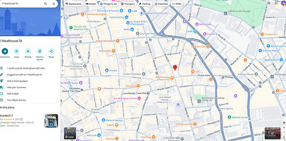
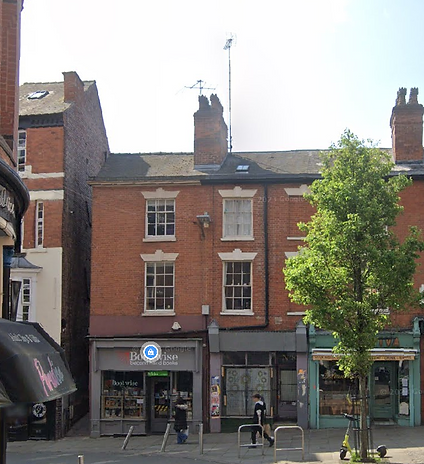
The reference photo was from the street of Nottingham in google map, the architect overlay was simple with the shops had placed at below the buildings. Additionally, it just easier to be design into a logo from the reference itself. The shape of the building was simple to be designed on Illustrator compare to multiple candidates that I had found on google maps. Most of the buildings were either too complicated to be designed or too simple to designed on Illustrator, so this is the base reference of the logo.
Progress

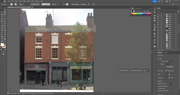
At the start of the process, I focus on the big area of the building, taking some of the time with how I adjust the placement of the shape of the building, and since the design version of the building starts to cover up the references, I lower the opacity till I can do all the small details in the reference itself. Then I focused on the windows, and since there are two sizes of the same window, which allowed me to make the indoor behind the window rather than the window frame itself, it took at least 30 minutes to manage four of them and the rest were duplicated from the version that I designed.
The shops below the building are my next to design since these three have complicated design, with the windows and doors using the rectangles tool, other than that, I had to select the exact colour I need to put on, and some of the shapes need to be edited with the pen tool to match the exact shape from the reference. I do this for at least an hour and a bit more since there are lots of different rectangles that I need to design at once from the reference alone.
Result


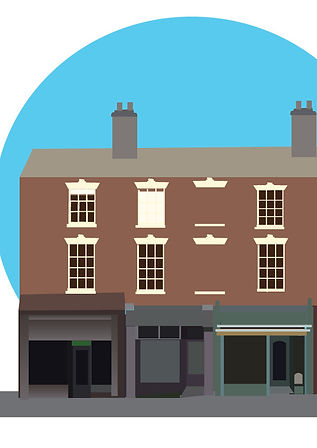
As a result of the project, it seemed simple to view from a distance, with some minor details in the logo itself. I felt satisfied to have even designed this building logo, despite it taking me half a day to complete. The colours and shapes were placed together with only the rectangle tool, with some adjustments with the pen tool to match the reference, which is a nice touch while designing the building logo. Additionally, the design had me on some management on which one to do first or which one to do last, from the details on each part of the building, then the background was added later on. There are some complications in designing a building logo at first, but I managed to break through the challenge that I have been given.
This can let me have some niche practice on simple designing for the simple logo itself and the concept was lean towards the entire logo that was well designed from Illustrator.
Typographic
Tom Muller (designer)
Tom Muller is one of the renowned designers who has created numerous designs for prominent companies worldwide. His designs around logos, graphic designs around superhero comics, especially some Marvel series like X-Men. His style is inspired from the modernist principles infused with a contemporary pop culture sensibility; he delivers future-forward work with a unique visual language that creates lasting impressions for designs. And his design has helped innovators, storytellers, and content creators make an impact on the cultural landscape by unifying narrative and brand design into compelling experiences.
The similarity of his design was the similar fonts and style, the flat design had evolved from the original logo or design of the brand, yet given the story and the straightforwardness to the audience. It also includes some simple colours as it seems to innovate its design in a contemporary way.
Example work

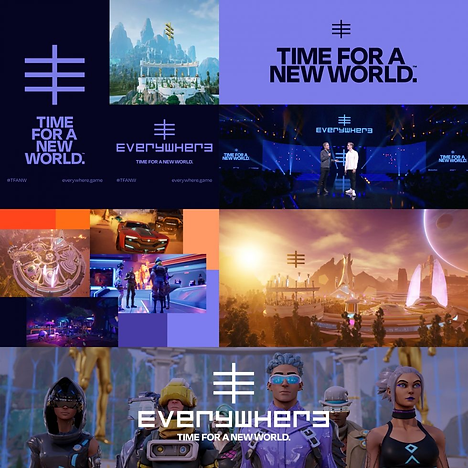

This is an example of work for the comic book series of X-Man, using visuals and colours to appeal to the audience and the shelf. The tone represents different situations of the team itself, letting colours blend into each other for the whole design. It was built around the new brand mark for the publication program for him to include bespoke typography, logos, book and cover design. This resulted in increased brand awareness and engagement through a unified brand system that was built in the language of "X". The positions of the characters in the comic have surrounded the specific design itself, which they were complicated compared to the logo "X" itself; it shows the simple design needed to stand out from the entire crowd of complications of the different designs.
For the design of "EVERYWHERE: TIME FOR A NEW WORLD", the design shows the similarity to the X-Man logo, which had a simple design that was easy to recognise and also popped out from the background itself, making it easier to be found when it was a background illustration. The text has also used a similar technique to be obvious from the background, and its font has innovations, getting the whole style and genre of the series. Additionally, the simple colour has diverse and innovative elements in the background.
Another example is 2000 AD, which has a similar design to the previous two designs that I had researched from the website; its design is mainly futuristic and simple, and the simple colour scheme makes it more prominent from the complicated background illustrations. The whole background was in-depth and had the stability between the pop colour in the poster itself.
Ria Hugh
Ria Hugh is a graphic designer, illustrator, writer, typographer and sometime comic book artist who has worked extensively for the British and American publishing, music, advertising and comic book industries. With a lot of the work that had done, his design was inspired from Saul Bass, Pop-art; with the colour that developed on his poster designs and illustrations had created the hard shade and lighting on each part of the
Example work


In all the illustrations that I have researched, I notice the uniqueness in how the colours mixed well for the environment itself, which pops out and the characters that were easier to recognise in the front. These have the pop art and Saul Bass-inspired illustrations, which have the paper quality in the entire premise of the illustration designs, giving the special pop colours in different angles of the poster. The similarities in those illustrations were how the backgrounds and elements were highly detailed and had multiple colours to show the pop art from the posters; compared to the people that were used in solid colours, it created a centre point of view of the entire illustration.
Other than that, the colours were balanced within the colour palette and have the colour theory and palette that were present on each illustration that Ria Hugh has designed. It felt colourful at first sight. The differences between those illustrations were how Ria tested on different types of illustrations with different background types and people.
Source material
-
Tom Muller (2024) This Design Life. Available at: https://www.thisdesignlife.net/interview/tom-muller/#:~:text=With%20an%20approach%20rooted%20in,%3A%20Designing%20Fiction%20%26%20Branding%20Stories. (Accessed: 16 September 2025).
-
Designing fiction & branding stories (no date) helloMuller. Available at: https://www.hellomuller.com/ (Accessed: 16 September 2025).
-
Device/Rian Hughes (no date) device-fonts. Available at: https://www.rianhughes.com/about (Accessed: 16 September 2025).
-
Device/Rian Hughes/Illustration (no date) device-fonts. Available at: https://www.rianhughes.com/portfolio/illustration (Accessed: 16 September 2025).
Practical work


When doing the text design, I was inspired by both of the designers, with each unique style, and I wanted to test it on Illustrator. It was a bit of hard work in all my ideas for different text fonts for the testing in Illustrations, placing different results on the logo itself, even though it is the same logo that I have focused on. For the logo that was made from a circle and a square, it took a while to finish.
As a starting point, I found it hard to find the editing that makes the whole shape into four columns after I placed the outline on the original shapes, then putting them together as one letter at a time was more of a creative experience for how the shapes were placed to form a letter. It was supposed to be fun and easy to make this in like an hour and a bit more. As I finished each letter, I merged the shapes together to form that specific letter.
Since it was only one colour, I had to think of another colour to test if it works with another colour. It felt like there was something additional to be done by today.
Result

As a result of the entire practical work, I found that the text with different fonts worked better together than only one font in the logo itself. Additionally, it felt different with each font that I settled on one logo; it felt consistent in deciding on different fonts for the logo and had different results for the logo.
Then the logo made from the shapes was the best thing I had designed since it made me spend the most time on it, despite the fact that there were a couple of detail errors in the logo itself, I had a good idea of how much I had to deal with all the designs that are in this small task.
Overall, it got me a lot of fun time with discovering some interesting combinations of different fonts, and I had to manage to design a logo from the shapes, despite it taking me ages to figure out how to make the shapes into 4 smaller parts.
Magazine illustrations
It is a task for magazine illustrations, it all about the illustration part of the magazine article, and it had some of the important part of focused on certain topics in the magazine article than recreated in three colours.
Researches

It is one of the illustrations created by Naomi Wilkinson, for the entire design was being simple with different colours and have the limited colour as possible in the entire illustration. It is colorful and joyful. she loves making pictures that have dynamic and interesting characters. She also love experimenting with patterns and colours in her work. It had result of how the entire illustrations being simple to read to the readers.
The illustration work was inspired from fine artists like Milton Avery, Pauline Boty and David Hockney, as well as mid-century graphics, packaging, kids’ books, interiors, films, books and daily life.
Source: Quirine (2021) The illustrations of Naomi Wilkinson, Flow Magazine - en. Available at: https://www.flowmagazine.com/flow-magazine/as-seen-in-flow/illustrations-naomi-wilkinson/ (Accessed: 18 September 2025).

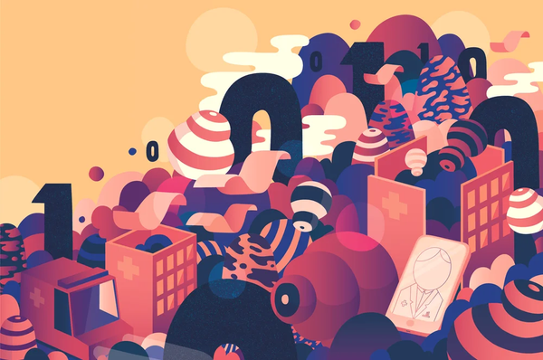
This illustration uses three colours yet has a gradient in some of the details of the illustration, making it unique for the dynamic of the illustration. The whole illustration is about the digitalisation of our health care services, and it is featured in two different uses in the magazine; a cropped version of the full spread illustration was also used as a cover. It makes the illustration readable, given how limited the colours were used in the cover itself, not a complicated colour for the illustrations.
Source: Editorial illustration for Chydenius Magazine (no date) Illustration Portfolio of Sami Viljanto. Available at: https://www.grandedeluxe.com/chydenius (Accessed: 18 September 2025).
Colours
The colours that I decided for the magazine illustration was a triad colour theory; green, purple, and orange, these I can used for the simple colour using on the illustration that I was planning to be do in the entire illustartion.

Source: Colour wheel, a colour pick (no date) Color.adobe.com. Available at: https://color.adobe.com/create/color-wheel (Accessed: 18 September 2025).
Idea
The idea that I had for the magazine is about "Are night clubs safe, especially for young woman". The illustration need to focused on clubs and woman as the biggest topic in the entire illustration that I plan, and there were colours that limited on green, orange and purple for the whole illustrations, it also inlucded light grey and while for some small details in the illustrations.
Progression


As the production was planned to be done on Photoshop, I soon realised that it was a bit challenging to do some perspective without the grid assist me to layout the entire illustration background or anything that were deal with perspective, so I use Procreate to made an entire illustration art. At the start, I sketch the building perspective, it given me a small chance to test out some of the harder perspective by myself; then later on the colouring part, I quickly use the select tool to fill up all the necessary colours in the part where I planned to be put the buildings in, the details of the background was implied from the alleyway where the bar club usually were, and there are a lot of luminal light as I tend to notice when walk across any bar club.
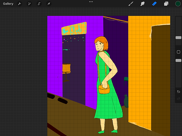
The human part was another challenge to be because my target was make this illustrations simple as possible yet given the details of a natural human body for the human character, as in my mind, it was target to given awareness of bar pub and its possible affect for young woman, so I given an average young woman look and give her a dress, I was thinking of woman with trousers which was a later projects. It given a little changes on the size of the dress and the length of the legs to finished off the design of the illustrations.

This is one of the illustrations that I supposed to make into the final result for the magazine illustration was about the small elements that was in the magazine. The idea was around the common thing that happened in the night club itself which is about the alcohol consumptions and the partying that within. So it gives the message about the probability of alcohol spiking and the effects of over the drinking consumptions for alcohols.
I had use the same colour palette from the big illustrations which is green, purple and orange, each helped for either the drink and the cup which had inspired designs from cocktail and mocktails, as the design idea was from the common drinks in the night clubs.
Result + Mockups


As the final result, I felt a bit underwhelmed by the design being as simple as possible for the character, since I usually take character design quite seriously, yet I felt a bit glad that it was presented as the way I had planned for the magazine illustration.
Additionally, I focused more on the background since it was a full illustration about whether nightclubs are good for young women, and it was easy to finish off all the backgrounds and elements since there are limitations on the colour scheme, and it gave me some creativity with the limited colour scheme that I planned.
Given that I had limited time and colour to finish the illustrations, it is simple and fair to have focused on the topic itself and have some creative moments for the colours in the illustrations.
Magazine Illustration Progress video
The process video was simple to break down for all the colour selections I had get in the magazine cover. And each part were processed with a sketching line that I outlined with the pen tool. The help to process the idea of each part of the idea with in the illustrations in Procreate.
Colour wheel... and understands colours
It is a small task about the colour wheel and have some understanding on colours, it happened at the elementary art class for a basic knowledge on colouring on basic art yet it given the biggest role on Illustrations and digital art too with the colour code and multiple usage on colour theory on how the colour got on usage.
Colour wheel history research
2000BC
Heavily stylized and symbolic art was often used in structures such as tombs and on monuments. Paintings in these areas had a heavy focus on the afterlife.
As the colours were often came from ores, crushed beetles, crushed bones, crushed blue glass or crushed herbs, but it was commonly used on graphs that record historical moments for the
1000
In 1000, religious figures and stories were the subject matter of a vast amount of art in both print and architecture during this age which was home to the Renaissance.
The colours were focused on blues and reds, sometimes yellow were use in any art pieces since it was the most common colour that found in nature and also the easiest to be gotten for any maker ship on any religious things around churches.
Colour palette selection


Those colour palettes were selected from the "Colour Hunt" website, and they can help me make an easier choice when picking colours without any issues with the artblocks I've come across, especially when running out of ideas for artwork.
All of those selections that I presented and downloaded were used in Illustrator to test out how the colours worked on the texts. It was an easy choice for how the colour palettes work on texts and logos.
Colour wheel

Colour wheel is one of the basic things that learnt on the start of any art or designing or any digital media learning for any starters to experts that taken notes as the solid foundations on anything to edited. As myself dealing with some designing on the actual colour wheel on Illustrator to had some preferences on how the colour theory works and placing the colours in order for better concept of colour work on each other.
Practical work
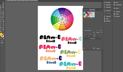
During practical work, I did some small research on colour palette to experience on the titles that I had designed last week, which had different verbal options on each part of the logo, and I had a fun time myself with all the colours that I tested out on each logo with every section of the logo itself.
As the bright colour palettes were capable of showing a parallel between great moods in the spectrum, it was easier to got recognised in a darker background. Shockingly, I had only focused on the light and grey tone side of the colours that fit into the title itself, comparing them side by side.
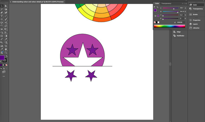
Then the logo is another side of the small task, I focused on only two colours and have specific designs on the circles and the stars. As the design was based on something that was more approachable for the toy company or an airline company, and with the shape of it, I came up with the star that was in the middle of the circle and the rectangle to crop off to this shape that I targeted.
During the colour selections, which were a bit complicated, I had thoughts mixed between red and green or orange and purple for the logo's base colour. Yet the final idea for the day, I used purple and blue since it was more neutral and approachable, and had the luxury branding as a whole logo.
Result


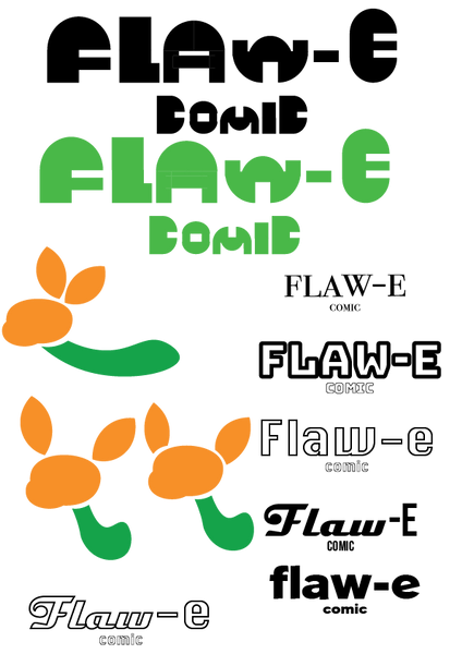
As a result of the title itself, I am glad that the entire project was done in Illustrator with some minor on colour changes each time I had an idea for the logo's colour or form. The title of the "Flaw - E comic" is mainly referring idea on the cartoon character name "Flaw - E" with the adventures that as the cartoon character should do, which I have the idea of the comic title be bright colour or something that is easier to recognised from all the muted colour background.
For the logos, I was maintained it's focused on the airline or flight to certain destinations, the stars was included for the skies that were perfect for flight with the safety within the service during the flight between places.
Redesigning brand
It is a relative small task for redesigning the entire brand logo, it mainly changes the appearances of the brand/any product logo with some changes in colour itself.
Research

The research for the logos, it wasn't the best choice that I had since it was Taco Bell and Patreon, even these logos have showed the obvious logo that were represents to the title of the brand itself; the Taco Bell brand logo was presented as the bell with a small taco at the bottom, it was simple design; then the Patreon Logo is about a coin putting in the slot with the orange background. For both of the logo are simple in design and being instantly know what is it when it only shows the logo itself.
Other than that, the ideas of redesign required some creative thinking on my sketches and during my practical work on redsigns both logo of the two brand.
Sketches

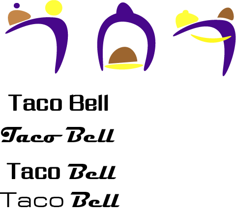
The sketches were inspired from the brand's purpose on given services or the overall on service. Like Taco Bell which revolves around tacos and the word "bell", so I drawn the idea of a person serving with the shape of the taco and the circle on the taco that fully became a bell, I also give the design of the person into a uppercase "T" to easier to recognised; another Taco Bell redesign was the logo itself became the bell with the simple curves and there is a taco in the centre of the design with the plate as the bottom. Other logo redesign was around Patreon, I focused on the supports that was around the idea of the creative supports to the creators and the animators that were managing the updates and some progresses.
Practical work

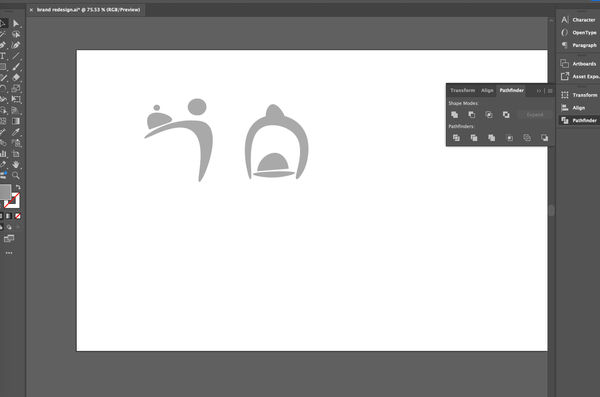
The practical work for the logos was some simple shaping with the pen tool on Illustrator, there were some adjustments on how different the logos look, how the curves adjust time to time as part of the logo itself, then I thought of adjusting the shapes into one of the letters of the title of the company, and it turns out not the best idea for the logo redesign.
The letters were separated between an uppercase "T" and an uppercase "A", and I used a pen tool to simplify their shape, then some details like a taco, a bell or a survent head. All of these ideas were later scrapped to be replaced by one design that looked like a bell, which served the same design purpose as a taco at the same time.
All that was left was the texts that needed to be experimented on, which font is the best for the final production, and there were a couple of candidates that I had done that represent the fast serving time, and generally being one of the big fast food chains.
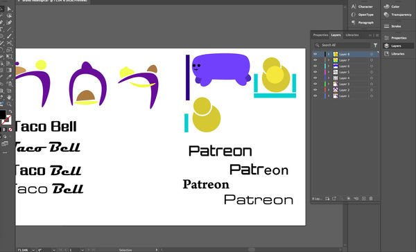
Then it was about another logo, which is a social media company, Patreon, where the process of designing it included some part about a coin slot or about donations to support the creators who have the content updated from time to time on the platform. My idea is to make another, smaller and similar version of the logo.
At the start, I mainly used circles to represent the coins in the redesigned logo, which I had made the big one that overlapped with the smaller coin. I also designed a small character as a reminder of how the support and cash go through the slot itself. The rectangles represented the slots of donations or support that people give.
Practical work (results)

All of the result was around different results that I had done from redesigning for two brand logo, which have different variants for the results, I had different decisions for the final result of the design. But all of this made me felt different from the tested out for different results for how the target to the audiences that the brand supposed to be focused on, and the colours were one of the important part of the brand logo which has shaped the whole meaning for it.
The text font were also important for the brand name, as each result I found better for fitting into the branding as much as possible for soul purpose of what the services to the costumers and what they were main deal with something that was important.
Final result


Best result


Those final results were focused on the colours of the backgrounds on the brand logos and some alterations on the text's colour, as to finalising the redesigns of them, I rearranged the logo and the text into the right position then use the arranged tool to make them align to each other. Also, those redesigned logos let me had the overview of how the entire designing behind all those logos that were supposed around the branding and services on each social media, restaurants, fashion etc.
Portfolio - Do What You Want Brief
It is a relatively huge projects for the Portfolio task, it was included for thinking what I will be dealing with all the illustrations or animations, or other things that around the design and animation course. Actively dealing with different style of the illustrations or animations of myself where I had previously done or getting the recent things done for the portfolio.
Idea
Mindmap
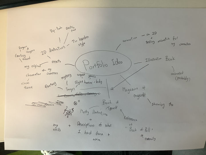
The idea around Portfolio was about Illustrations and having some sort of animations, where it had some outline of where to pointed to which one is which, it may included some tastings on the Illustrations where I showcased on YouTube. Additionally, I connect all the things that I needed to gathered as the brief of the Portfolio project. As I had thinking about the illustration book about animations and artworks that I had included in the book itself.
Project brief
The idea of the portfolio is about the whole concept of an Illustration book. It describes my achievements in my skills and my life, who I am, and what I am doing with different projects. There were some interesting illustrations that were drawn in some corner of the pages that are in the book itself. The need to deal with illustrations on Procreate, but Photoshop is for finalisations for the basic shapes from the original illustrations and turning them into that specific page.
If there were time for necessary animating the pages, I animated them on After Effects to test out how the illustrated parts move in the pages. It felt entertaining when it was animated, and it made it slightly easier to introduce those parts of different projects and ideas that I had done before.
As different pages needed to be listed into different categories, like personal projects and college projects; personal projects were had some differences on fanarts, casual artwork, character designs, and background designs, as for the college project, I had to take a couple of photograph on some of the finish animations to adding with paragraphs to prove that I made the entire project. There were some art and illustration projects in the college projects section. All projects' processes and how I felt are necessary to write down into short notes in a document, making it easier to break down certain aspects of the projects and what that idea stands for. It was related to a graphic novel like too.
It is targeting audiences was around 10 to 15 years olds with PG scenes where I introduced the importance of being creativity at the same time having some true horror in some panel of the illustration book.
Overall, to shorten the brief, I am making an illustration book around 5 to 10 pages, which contains all the important projects that I have done the best, adding descriptions on the side of all the illustrations in the pages, pointing out my personal life where I give a life at the some creativity.
Research
Book of Bill
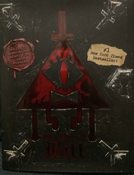
There are certain pages that will be inspired from "The Book of Bill", which the whole book itself was Bill Cipher's monologues and stories about him and his surroundings, the pages have the certain themed that had some texts mostly at the same time having some illustrations that was around the text itself to easier to understands the story around Bill, at the same time have some horrors and mysteries that people who like to solve or theories the show again like a it is one part of the puzzle. It is fun to looked at the book that can engaged on most of the audiences in different form in a fandom.


And this has give me some inspirations on how the each pages have layout and how each timeline of the pages have different style to tested in different sections of the story. I was trying to attempt different or similar art style for easy engaging for different fandoms of the people or some other peoples that interested in artworks.
Hirsch, A. (2024) The book of bill. NY, NY: Hyperion Avenue.
Gothic art style + bookcover
The Goths were a Germanic people who invaded the Roman Empire and the word 'Gothic' come back during the Renaissance to describe the medieval architecture, the history has given 'Gothic' for different meaning at that time for describing medieval culture, particularly art and architecture. In the Middle Ages had not called their culture Gothic which the term was applied retrospectively as an insult for the culture. In the 1530s, an Italian architect and historian, Giorgio Vasari was the first to use the word to describe medieval art, as a synonym for 'barbaric'.
When the fashion for building in a neoclassical style gripped Britain in the later 17th and 18th Centuries, medieval architecture was thought by many to be tasteless - lacking in elegance and proportion. It was labelled Gothic because it was considered the opposite of classical architecture.
As the word and fashions change in the 18th century, and there were more people became interested into medieval architecture and many people started experimenting the gothic design, majorly wealthy; the wealthy built for the mock-medieval buildings, and some even constructed gothic ruins (as known as 'follies') in their gardens.
This is one of the example of the fantasy/gothic style book cover that I wanted to based off, and it was revolving around glasses, natures and mythical things that was fitting into the whole idea of the book and the cover itself. In any means, I had the ideas around the style was revolved around the nature itself.

These images were from a tutorial website of describing how the person done the gothic illustrations with a couple of steps and how they changed from sketches to the final part of the illustrations. Those illustrations work were amazingly made for each part of the story that can told to the audiences.
-
Where does the word goth come from? (2023) BBC Bitesize. Available at: https://www.bbc.co.uk/bitesize/articles/z8dwqfr#:~:text=The%20Goths%20were%20a%20Germanic,’vandal’%20still%20is%20today. (Accessed: 13 October 2025).
-
Book cover artworks (2023) Mario Nevado Art. Available at: https://marionevado.art/portfolio/book-covers-collection/ (Accessed: 13 October 2025).
-
ArtRocket_en (2022) Gothic stylization using the fundamentals of illustration, Art Rocket. Available at: https://www.clipstudio.net/how-to-draw/archives/157364 (Accessed: 13 October 2025).
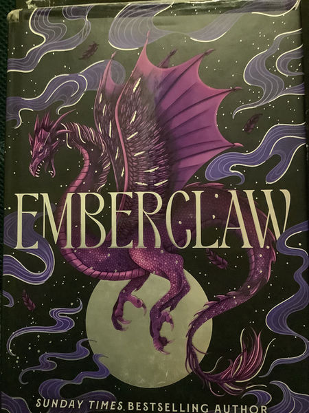
This is a cover of a book "EMBERCLAW", as it was depicted as a dragon at the centre of the book besides the title itself, which the whole story itself was about dragons and humans, and this book was the part two of the story.
The colour of the book cover was revolved around purple, yellow, white, and black, I was assure it was the simple choice of colour choice for the book cover to be readable and having the simple illustrations at the middle to catch the attentions to people.
As the illustrations were complications for how the character can portrayed majorly around dragons and magics.
Lam, L.R. (2025) Emberclaw. New York: DAW Books.

Cici's Journal: The Adventures of a Writer-in-Training was one of the example for a mixed with realistic look yet having a cartoonish looking to appealing to the people age around 10 to 13, there a lot of blend of the water colouring in different panel of the book and have appeared to be have the story development of the main protagonist for the consistance on a medium pacing of the story.
Myers, L. (2019) Graphic novels for kids, Adventure in a Box. Available at: https://www.adventure-in-a-box.com/graphic-novels-for-kids/ (Accessed: 16 October 2025).
Photo research

There are some scenes that have to referenced from actual places or things that I had memories toward them, which including some photo needed to be taken for references or photo bashing in the pages in the book. It was easier to me to figuring out on some materials or illustrations that were a bit complicated to draw.
At the first page, I referenced my old home from google maps to layout the basics on the building itself in the left top corner of the first page when introduction of myself, the colours were a bit needed to look in detailed towards the building itself. The same page, I included some books were needed to take photos and actual research for photo bashed into the final production of the illustration book. It was some easy choice for me for handle with the adjustments from drawing the replica of the specific part of the comics.
These were practically how and what is affected to me now for how they were illustrated in a sense of story telling and how each part was been told.
Furniture, textures and drawings for pages.

There is one thing about dealing with multiple columns is some furniture or drawings were too complicated for draw or had a rush to remade into different part of the, so I searched actual pictures online to put into the selections in Photoshop to finalised in the entire illustrations itself. It helped me improved on photo management and have the inspirations on the actual thing for easier to progress different parts of the illustrations pages in Photoshop and Procreate.
-
Vintage disney Mickey Mouse telephone 1990s tested works official licensed Disney Phone Segan/Telemania Rotary Button Phone retro nostalgic - etsy UK (no date) etsy. Available at: https://www.etsy.com/uk/listing/1734535511/vintage-disney-mickey-mouse-telephone (Accessed: 27 November 2025).
-
Identity v official website - Survivor catagory (no date) Identity V Official Website. Available at: https://www.identityvgame.com/en/character/index.html?type=survivors (Accessed: 10 December 2025).
-
(No date) A white wall with water drops on it photo – free image image on unsplash. Available at: https://unsplash.com/photos/a-white-wall-with-water-drops-on-it-AKHh5Vie5AU (Accessed: 01 December 2025).
Practical work
Sketches
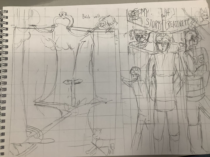
This is the first sketch of the book cover was basic idea of my portfolio illustration book, it was inspired from "The Book of Bill" and a mixed of different part of fantasy and horror of the book cover, I was no idea what my target audiences from the illustration book so the book cover felt empty from the sight.
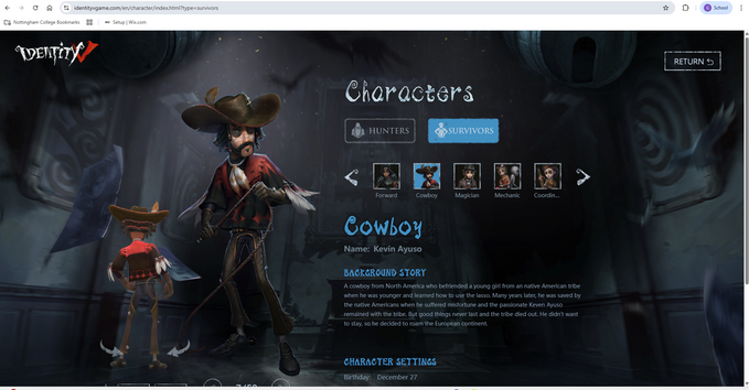
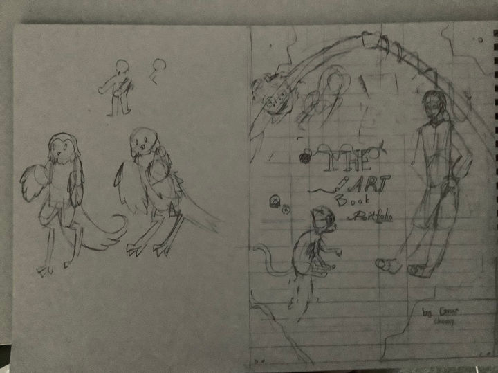
The one sketch at the left was the idea of deciding what path I should choose to become in the future, which was a straight forward messages for how my younger self was needed to be decided to be for the whole moment with some hints of different medias that I had got in touch and given the massive amount of interest, like the spider character at one corner was from the game "Identity V".
Then the sketch at the right was the idea for my story of being creative which affects while I am growing up, the characters from the sides were the variants of myself, the left was my younger self, then the right was the character that I created at 2016 where she was inspired from a robot character from an indie game "Undertale", the character still sticks around in my mind while I am dealing with artworks, illustrations and animations, remain the same appearances while I draw her, which given chance for me to notice how I improve my art style.
Other than that on the right sketching idea, I basically putting in mirrors at the back based of the book cover and have the symbol of reflecting at the past or the character designs that can changed over time, the middle of the column were some of the references for any media that I had consumed on social media and have the hype fixated for years and years.
Writing the book


The writing about the book's context was pushing towards on a reading my story out to the audience without loosing any parts of how being creative isn't a bad thing and it was a real event for some of the artist and digital designers in the industry, there were some plot points when writing a short story about myself within a couple of pages to people since I wanted to talk a lot about my story of designing and animations within an illustration book.
Later, I had the changes over and over again for fitting into the story itself and keeping it short to clear out the small things that I had encountered and changed because of the time and the situation where I needed to focused more on illustration itself.
Book storyboarding
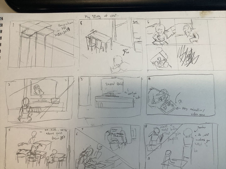
Planning of the book was a bit hard since I had to needed to be orginised where I can put these scenes in different pages of the book, with in some details that needed to be done on Procreate and Photoshop.
The storyboard of the book was a thinking of how I even put the illustrations in order to describe my short story of creativity and my dreams of wanting to becoming an illustration for illustration books and at the same time presuming with digital art as the improvements of how I done illustrations.
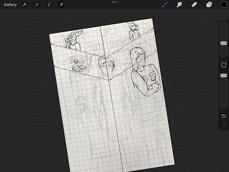
My original idea was only a full illustration book with only conversations in different panels, but I changed my mind for illustrations at the side and majorly have text to told my story thoroughly with how I became the current situation I had, with introductions around people I had interacted with. It felt like a light graphics novel targeting for kids to teens.
Production of the book cover
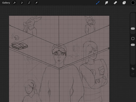
At the start of the sketch phase, I start to finalise the final sketch idea from the sketchbook, cleaning up all the sketches from the sketchbook since there will be some changes crossover in my mind at the since the start of the production of the book cover, which including details of clothing, character poses, or placements on some objects at the side of the poster; the entire part was finalised in the sketching and it felt great to having the book cover to be finalised from a sketching part.
During the outline of the book cover, I started with the background since it is the most complicated part with the ridges at the glass background, then I focused what was in front of me, which were the characters, I started to focus on the cat first with the easiest character I can done with the simple shape. Then the human characters at the front were a challenge for me to complete with some details on the clothes and facial expressions that similar to Tim Burdon's style, a bit of exaggerating body shapes and have the memorising facial expressions. It cause me for a bit to be finishing the outline of the book cover which can be changed overtime when for the colour of the illustration book cover.


As I make the production of the book cover takes me a lot of time since I was visit back to Hong Kong for two weeks in half-term, but I had the right idea from the sketches in my sketch book, and I focused on the background first since there were a lot of area to cover with colouring in the part of the characters. I also adding the base colour just to overlay the characters and also easy to distinctive from the background colour with the outlines.
The characters on the left side of the book cover added after the outline is done from the previous layer and it was planned to made it a bit transparent when uploaded on Photoshop. Overall it was complicated from the start of the project itself since I had a well term break.
As the colouring of the book cover was a huge job after the outlines of the book cover, there were a lot of colours were used in different characters, which was overlayed from the gray colour that I did first after the outline of the book cover to easier to colouring and shading in one layer. As each part of colours covered the whole book cover, it is eaiser to me to getting through textures and outline changes on detail of the clothes and skins of the character.
The entire production of colouring the rest of the cover was a bit much since there were attentions on details on the characters with the adjustments on the placements.
Production for book content
Page 1

The first page of the book was a bit of a work over different panels besides the writing of the story itself, which had some simple layout from bold pen which was an easy choice for me to taking care of sketches and finalised with the layout itself. Than I was a bit of the involvement on the colouring for the comic after the fine line in the pages, in between finishing one page, I had layout the rest of the illustration book for easier task on different pages.
I had to focused on how I layout the colours in the specific columns with the darker shades of grey for easier to layout the rest of the colours of the entire paper.

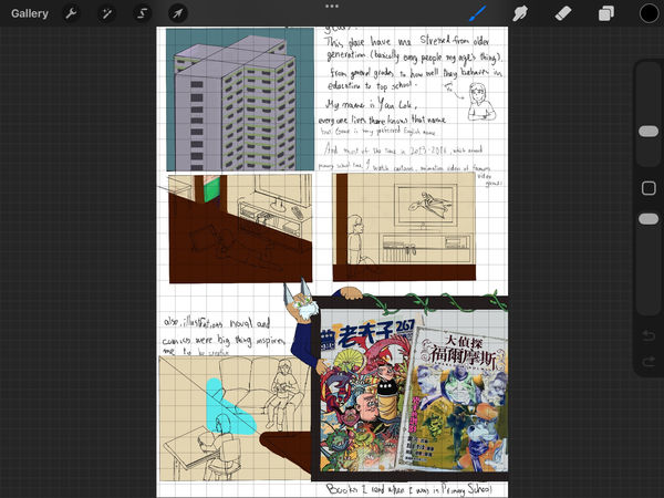
For the first page of the illustration book, I included a brief introduction of myself and how I became interested in different forms of art, as most digital artists, designers, or animators would say. I also felt a bit like an outcast because of my poor performance in school during early childhood, which put a lot of pressure on me, and it was then that creativity started to take form for me.
It was a quick illustration since it had only a couple of illustrations on the first page, and the rest of the illustrations would be a lot more busier the more I had laid off myself.
Page 2

The second page was continued from the first page, and had mainly writing and then some illustrations next, there were a couple of details of each column in one illustration which I had to focused on, each columns of the but I later realised that it takes too long for think of someone's face in detail, so I think of a simple way to copy and paste some of the clothings and faces for easier references for changes in different columns.
I also changed some of the columns to make the story a bit longer to read from one illustration to another. And the colouring was the most crucial when dealing with multiple different parts of positions with the same colour palettes, as it had the consistency of how the entire page filled with illustrations. There were some duplications in colours and characters to save some time for other pages and project evaluations.
There were some changes after a while dealing with the outline of the second page; I changed the bottom of the page to include more in the story of my creative life and interesting effects that I will add in my life. It also included some of the angles of my old place as best I could, since I didn't remember much about the house's layout when moving.
Then there is some shading, and the positions are after uploading the illustration as a Photoshop file. The reason is to have the easiest way of how the characters were presented, and also to enhance the line art of the illustration, I also that will be easy to figure out on which layer can be put in order.
Later, I had some issues with the sizes of the illustrations because each panel took a lot of space with the text alone, so I putting the panels tightly together, that was I planned to be rearranged in the next two pages of illustration
Page 3

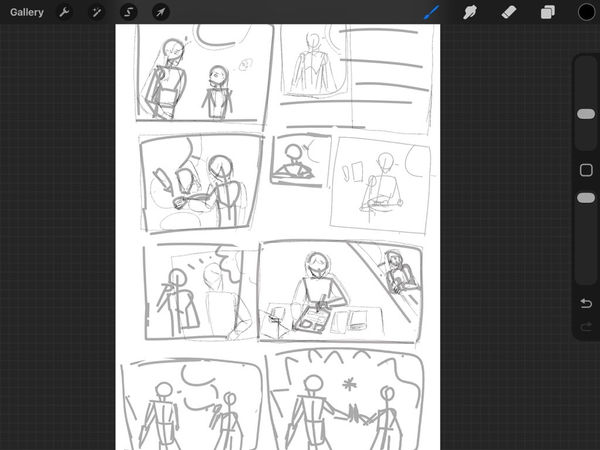
This is the third and fourth page of the illustration book, and it was a bit busy since I had other pages to manage details of the characters with sketches and final line in the entire illustration itself, there were a couple of changes while on the sketches after the layout, I had thought of change of the order of the pages in the illustration book itself to a small book that easy to convey the storytelling.
As when I had the rush in the time, I'm just only goes with the outline of illustrations book pages than finalised with line art of the illustrations to catch up different pages of the book.
I also think of using the same assets for recurring angles and positions the characters had made to save some time when drawing the rest of the pages of the illustration book, which helped a lot in saving time on drawing lines with the same appearances in two characters.

Than there is the colouring part of the illustrations, as usual, I used the simple colours at the background to represents the dream like states and have the characters more popped out from the simple background, and one column was green for later using grass texture when put on Photoshop. I also use the book cover as the reference photo for the colours of the character, as let the character's colour as much accurate as possible without guessing the colours over and over again.
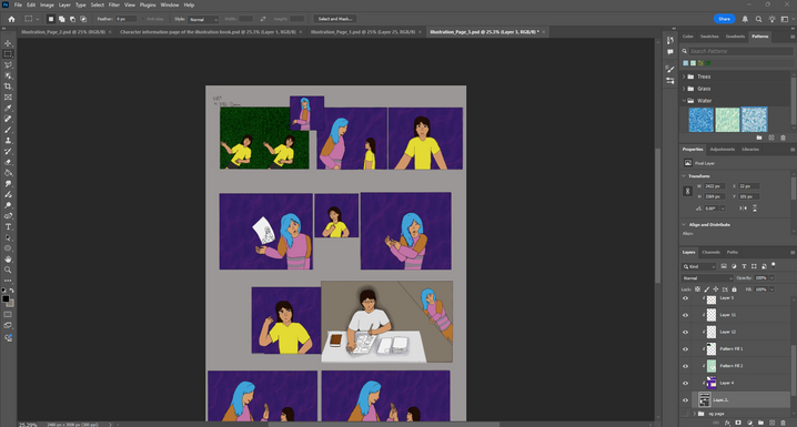
After I uploaded on Photoshop, I focused on finalised with textures of the background and the shading of the characters, I am still trying to figure out on where I should pointed the lights on the characters since some scenes were there were no light rebound from the surface and had some light shading on the below the parts of the character.
Than I manage the columns of page 3 after fuse them together after duplicate the group, I came to the realise I had to rearranged things when produce page 4 of Illustration book with minimise the illustrations to at least 6 columns to fit the bottom part of page 3 of illustration book.
Page 4
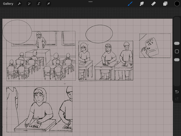
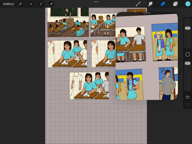
At page 4, I had finished only 6 sections since I was planned to added the extra columns from page 3 from the size changes in columns in Photoshop, it majorly revolves around school when teacher asking the question about what is the dream jobs of the kids, including me of course (which I put myself quite in a middle of each column).
The reason it is just me is a bit more detailed and putting at the centre of the column, it is just for showing that I'm usually self-centred and would forgot most of the people around that had walked passed me or had the same class or grade as me for years.
At the colouring part of the illustrations, I had to use the same colour on the clothes since primary schools in Hong Kong (and mainly Asian countries) are using the same clothing depends for girl or boy, so I duplicate the colours to the line art for the students for getting the accurate pictures for the Hong Kong school. I also using the same assets for the scenes and characters for quicker productions on the pages and easier to change the positions and characters in the column.
Also the detailed at the background had included actual text in the chuckboard and paper, and also in Traditional Chinese which showed that I'm from Hong Kong in the past 13 years. Despite the position error of the text, I had my best to remember the events that occurred in that day. I written comic book artist/illustrator at that one scene since I like comics and want to show emotions through art.
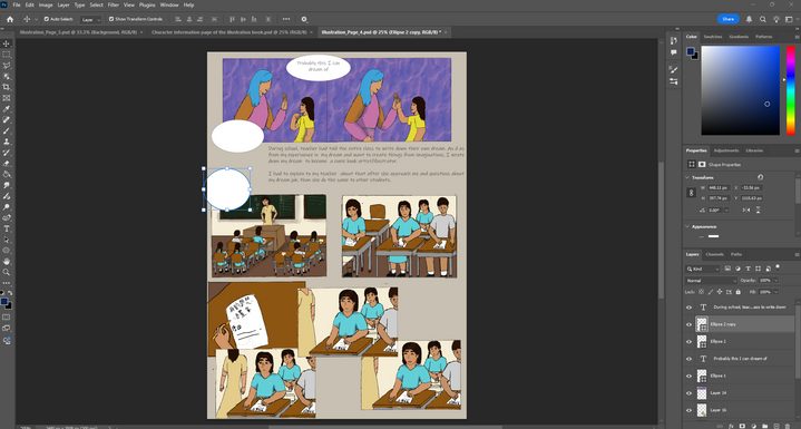
Page 5


Page 5 of the illustrations was a bit quicker, dealing with the 5-hour gap between breaks and thinking about where I could position all the illustrations I had done between columns, including shading in parts of the columns when colouring. The reason it was done was to tell the influences from mainly video games, the one game that was important for my life since 12 was Identity V, introduced by my friend, and I had an obsession with the game (with the creation of one of my inserted characters, Carol)

Another fact that I was mostly done with the same face and made some edits and changes at best for the sake of time, and also included duplications of background objects when colouring the page for the same reason. It was the best thing when the illustration book had the same background and characters in the same consistency, and a relief from the file management.
Page 6
Page 6 of the book is a continue for how I am proceed to attempt to write and draw an illustration book with hand made book that I previous days ago, and had the idea for how I am going through with different style that referenced from video game crossovers stories or had the base story of my first creations of how she was came from in a fictional story. These were the scraped stories that I had made in my mind despite the lack of researches and inspirations of the story and had the narrow window to be produce the book by mtself.
At least it was fun to be attempt to made a story with my own time and skill at the time. For illustrated the scene, I simplified it into a couple of actions where I attempts to draw some scenes of the illustration book and scrape it.
The production of the page was a bit slow because of how I am going to face my difficulties of the pervious productions without any solid plan or researches for making the illustrations (I was 12 and not know much), it had included with the break the forth wall with one segment for me and my character's conversations done on Photoshop. The additional shading was necessary for me to done on Procreate to save some time with the selection fill tool in the app.
Page 7 + 8
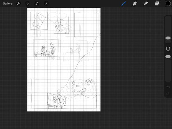
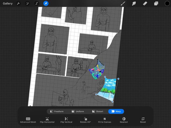

Page 7 and 8 are connected to each other since I had a wide range of characters I had to done for the narrative of which projects that I had done for the entire project itself, it was a bit of rush for dealing with the characters in the end of the book so the outline of the characters looked had lack of chacteristic (especially page 8).
The feeling of finished the project was a sigh of relief yet had the stressed overnight just to finished the pages that I pushed over till today, the presentations of the characters was great for all and had the credit of myself for made on digitally and traditionally after what happened for my life experiances.
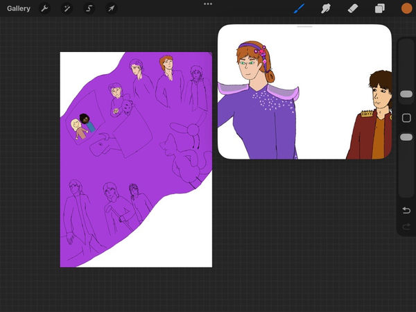

Even the colouring was from the actual referenced in the older and new design of the characters I had made, page 7 had me for facing new things and getting throught with my mother teaching me about art and design, despite I had my ways to let myself improved till now, additionally with the gift of my first sketchbook at my 12 year old birthday.
At page 8, I added most of my original characters in the page and planned to had the thank for the readers to read the book on Photoshop, the colours were selected from the newest designs and colour selections of the original character. I had also included the two original characters from Planet Earth illustration book in a simple art style.
Results
Book cover
This is my first result of the book cover that I had purely drawn on Procreate, and there were mostly done on the spot with the shading and textures of the characters and also the appearances were amazingly portrayed in the poster itself, the line up of the characters were great with the limited colourations can let each part showed from the background.
I was planned to had some small changes after putting into Photoshop with changes on the text itself and some small changes in the background.
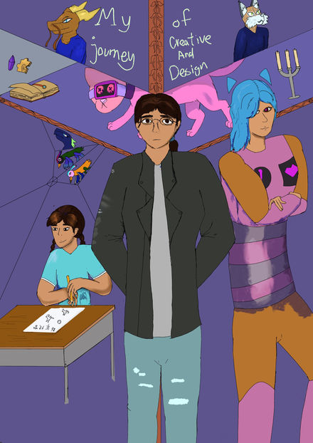

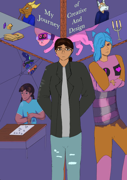
There is one change in Photoshop: the text on the book cover. I changed the font on the book cover, and it helped quite a bit with how the cover presented the whole book. The colours of the book cover were great, with how muted the colours of most of the designs were, yet had some bright coloured characters that were presented in the book, which shows how I looked in the world and in some of the past times.
Each position of the characters was greatly distorted since the first production. They also had the right tone of how I present myself, my past self, and other artworks and characters I had done and encountered over the years.
There were a couple of changes that will be done by the time I notice the missed error on the side of the book cover. I had to make a mirror effect overlay the characters at the left side of the book cover, so I erase the bottom of the table to create a fading affect, then lower the opacity to 60% to 80%, it was supposed to making a fading memories of how I was inspired to wanting to became a book illustrator and character designer, reflected for my past actions effects me today.
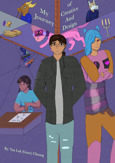
Book content
Character information
The result of the page to show character information was important for introduce characters the moment open the book, adding with the whole meaning of the story of the illustration book with the characters that only existed.
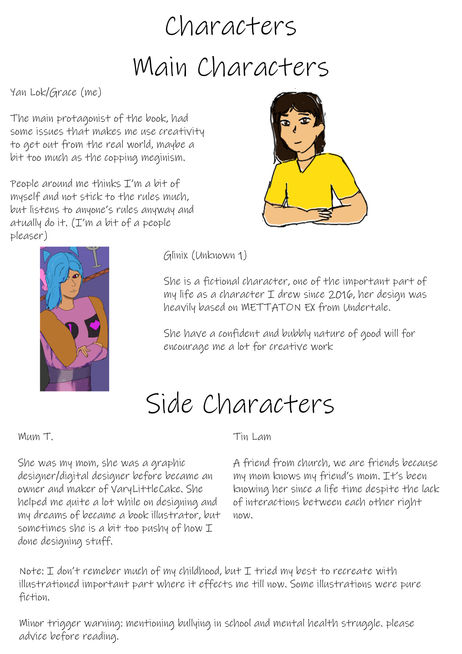
Page 1

This is the first result of the illustration book page, which was mostly done with the colouring and the layout of the entire scene. It was simple for me to finish the small details on the small screen in two columns, and I had to be more patient and practice to get the lineart and the colours great.
The reason for finishing most of the tasks of the illustration book on Procreate was the effectiveness of transferring the line art of the characters that were drawn on the tablet. I got used to it, but I was thinking of having some changes and practice on character designs on Photoshop with the graphics tablet.
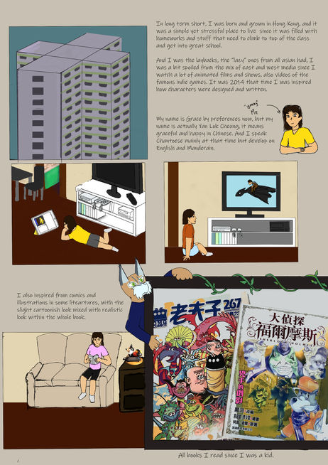
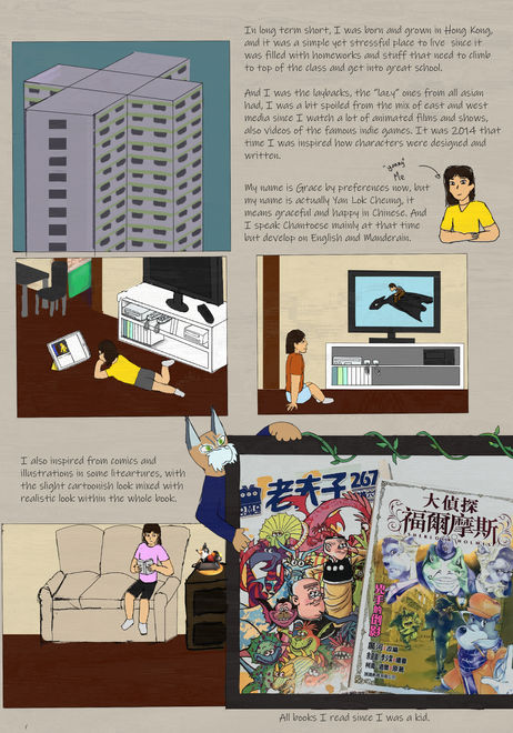
There were changes on page 1 and added the writing on Photoshop, the reason was after I realised that writing on Procreate was not tidy enough and had got lots of space. The illustrations had also included with some changes like positioning the couch back to centre and adding the phone image at the side that blend in quite well for my art style. Every colour that every column that the girl that presented in different column was me wearing different outfit combination because it was settled at spring to summer.
Page 2

The first result of illustration page 2 is a bit of a stretch since there were a lot of placements on the characters in one part of the place, originally there were text that I written in the small box, but scraped because it was tight in space of the illustrations.
The colours of the illustrations were muted since i don't visibly remembered what happened on that specific time of primary school, it's like the memories automatically shuts off when I tried my best to remember.


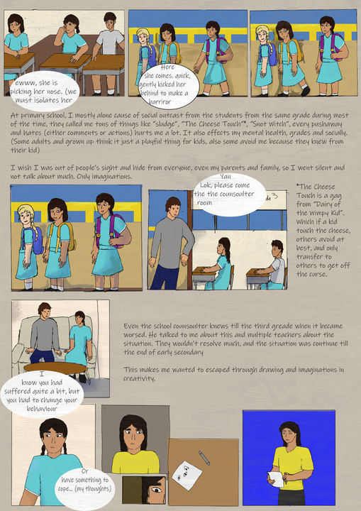
A lot of changes in page 2 was included the positions of the illustration columns and the text that I added after added in Photoshop, it had also included shading of any physical objects, I also adjust some columns into page 3 because of lack of rooms for all the text and illustrations in page 2, also it made the people continue to read the book of my creative and design life.
Page 3
This is the first result of illustration page 3, I had the base colours were done on the characters and how they were placed in the pages. It had progress on telling a story of how I wanting to become a book illustrator with in a dream. I don't actually remember much of a dream during sleep but I'm sure of wanting to become book illustrator/character designer.
So I made up the scene in that page after page 2 and had insert the first original character I had made.


Then the edited versions of page 3 were mostly placed in the positions of the illustration columns, including the text that took up the most space. It was a bit chaotic when editing, but the final result was the best, and the bottom of the illustration moved to page 4. Colours had been edited to have a dream-like state, which I had a lack of memories of what I wanted to become; it also helped the characters pop out a bit more from the background.
Page 4

This is one part of page 4 since I had more on the class of what is my dream job, the colours were lacking in the class room to show I had the lack of memory of the place and slowly fading away, there were some changes on people in the class because I'm at third grade and had to changes class every year in primary school.
Of course, there were some details in the text I had written down on a chalkboard and paper; it showed I was in Hong Kong for 13 years.


After the power of editing on Photoshop, I had faced a couple of adjustments on the additional parts from the last page, which felt easy afterwards when adding some context and conversations/thoughts of what I am going to be when I grow up. Adding the small context besides the illustrations was readable to the majority of the audience, and with the texture overlays, it made the whole page better.
The only thing I forgot to write was to translate the text on the paper as "my dream" and "comic book artist" because most of the audience I targeted were English-speaking.
Page 5

This is the first result of page 5, I had most of the illustrations were done on Procreate with the shadings and the positions of the characters, the colours at the background were muted as the same as usual to shows that I have let myself isolated from the real world to my own world more.
Another reason my clothes are bright and the background things were muted and minimum because I got my coping mechanism of imaginations on the max of let my creative thoughts flow at the same time for consider the real world is my part. And forgets most of the things that happened back in Hong Kong.
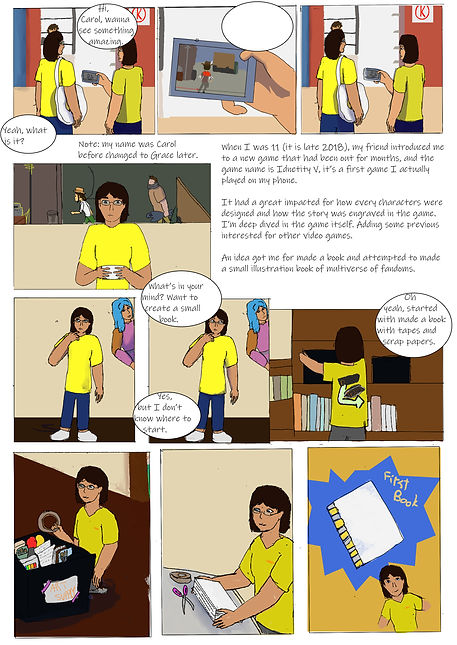


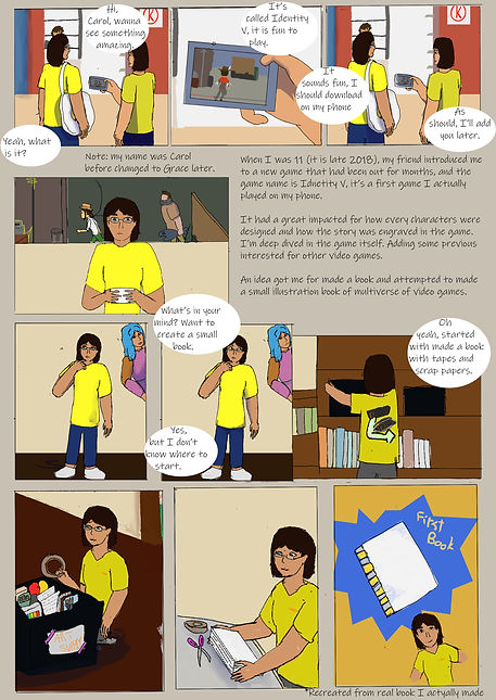
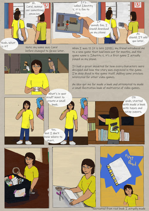
Adding text was a bit more lively on what is the context of the page itself of what happened in my life between me and other objects in the house, I also taken some time to adjusting the areas where I had to changed in positions on the accurate scale of the illustrations that I had done so far as the whole book itself. It felt great when finishing the last few pages of the entire book itself with the context written and with the shading of the characters more accurately for how the lights going through the characters.
Page 6
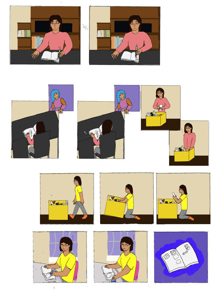
Page 6 was adding a bit of innovations of breaking some fourth wall with my original character, it made the whole story a bit interesting for how the characters were slightly aware for the illustration book columns yet had kept the secret for how they know.
The story was continued for me of attempt for creating an illustration book without a proper research on character's anatomy and how the story was gone, so I scraped the book. It also included the origin story of Glinix (the original character's name).


Also in the edited version on Photoshop, I had included with the text of translated what I had thought in the page and had the brief explanations at the top corner of page 6 of the illustration book. There was included the shift of the finished illustrations for better in space managements on the illustrations, and had the readable parts like speech and thought bubbles.
Overall, it was fun at last a couple of weeks to finished the project by myself with the limited time of submitting the illustration book to the tutor and uploaded online/website to had a brief evaluation.
Page 7
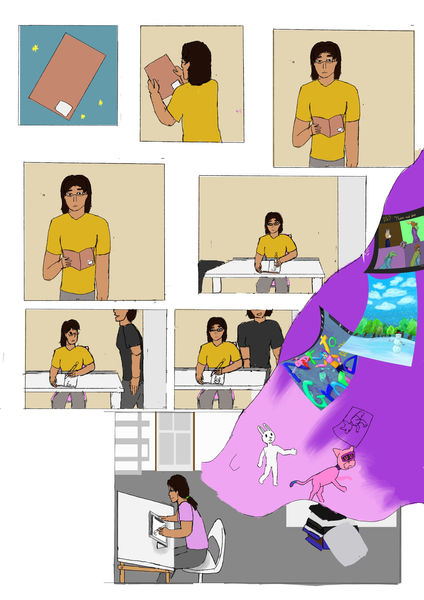
The page 7 raw result was simple as straightforward for introduced me to sketchbooks for easy to made design sketches and doodles in the one place, than my mother got in and had to teach me of some basic drawings and the entire designing things.
Than had a time skip to present day of me in my room in UK with the tablet to deal with art mostly digitally despite there are needed in traditional sketches for base ideas to the characters.


Adding the text were included with the context of how the characters were moved from left to right and had the more important events of describe what happened there, I had some missing point for the context of the story where I got my tablet to do the art that I currently done. It had rich info of the artwork I had done within the imaginations bubble (by the colour of pink and purple) with the artwork and illustrations that I had done for the 5 year mark.
Page 8
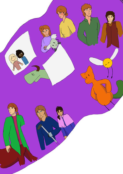
The first result of page 8 was empty with only illustrations with while background, I was planned to added the names of my original characters as that I had done finished and changes through out the years. Despite there are some missing arms and legs (it is a rush on time), I had covered most of the character's appearances.
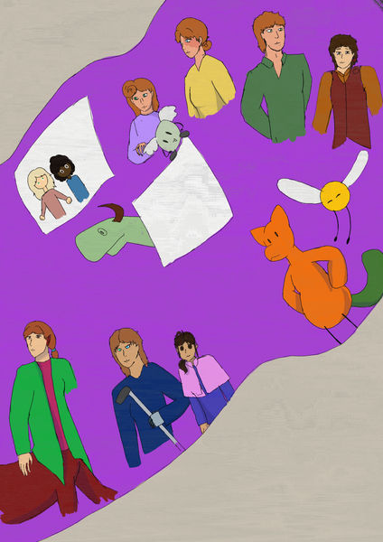
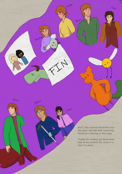

The results after Photoshop were great since there were a couple of changes for positions on the characters and adding some editing to erase the end part of the non-existing part of the characters, since I had a lack of time to finish at the end of the project.
But I had added the names and additional notes that they are my original characters and had a name for them (on other documents), just to make it easier to memorise them and their personality.
Also, the colours were quite amazing to show each character had their unique appearances to each other, the main reason I had the appeal on redheads was that they look amazing on hair, despite the colours being commonly found on people who were brown or black.
Final product (whole book)
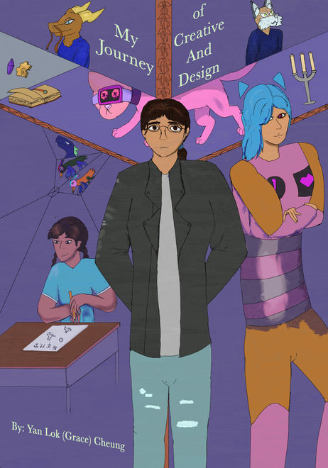

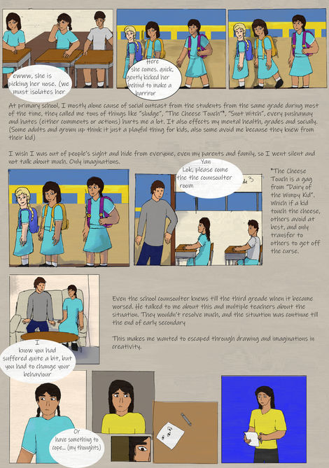


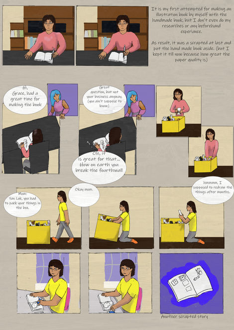
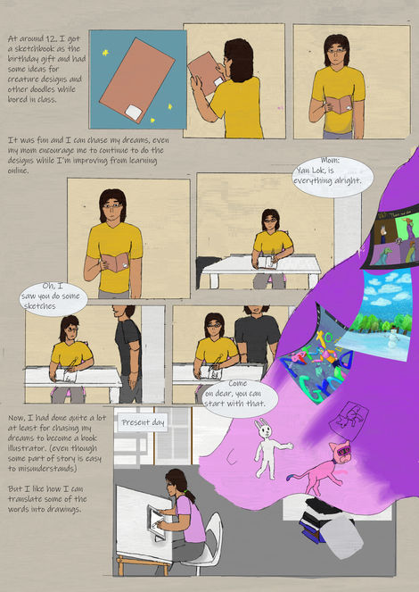

As the whole book itself was a quick pacing as in 10 pages, it took me a lot of time for produced each pages with illustrations from Procreate and had a lot of the time with the colouring all the pages in one go, so it was a great thing to applied a slight texture on to make it looked a little darker and had the old film vibe despite with the mixed of bright colours on a couple of columns with detailed character design on younger me and the original character Glinix (that's her name).
Every column of the illustration was mixed between lively and stiff due to my being more alone by myself and having a lack of social skills with people; there was a quick shift between time skips due to that lack of skill, and I did not make many great memories in the past, especially during childhood. The ending part was amazing due to the appearances on old characters and newer characters that I had made post-2019, it was to show that how I remember them as one part of creating them and had created stories about them.
Evaluations
At the start of the "Do What You Want" brief project, I was thinking of creating an illustration book about my life and my creative journey, highlighting the changes that had occurred for the better up to that point, and I had ideas swirling in my mind. The style was inspired a bit by dark fantasy and Tim Burden's style, with some characters featuring exaggerated features and darker tones in the background and on the characters themselves. And I also researched a couple of photos and textures to fit in the pages of the illustration book, yet most of the creations were on Procreate and Photoshop for further editing on the illustrations.
The only sketches were the book cover with three variants on how I portrayed the characters with some important features; it must be in a darker tone and had the characters with a darker look, yet had my personal style on it. The background of the book cover was referenced on a couple of video games I had taken interest in and added at the back, focused on the main character, me and the first original character since 2016.
Than the production of the pages were a hassle, some slow in production some were a bit rushed because I had the slight lack of time managements on the page productions in College or outside of College, the main talked of the illustration book was about how I was inspired to do illustrations and art, and the main reasons to be creative in mind and had all imaginations in the real world.
There were some illustrations that were reused for the character's face angle and some colours for use in some of the characters' scenes for better perspective. These were the reasons I had saved some time to finish the project as soon as possible.
Overall, the illustration book was quick-paced, with only 10 pages in total, but it provided wonderful context on each page about the important things that happened to me. The information page was one of the introductions with the important characters in the illustration book. Additionally, the background colours were muted to centre out the characters in one shot and showed my perspective on the world.
Word from the tutor
After I got the book to the tutor to teams and got some words after, it had mostly well made and have improved in my style and technical ability in drawing the illustration book, but I had to focused on observations on working on anatomy and perspective to helped more on drawing comics and any illustration book in the future. It was referred on structures and people anatomy within the illustrations that I had to studied since I was got used to draw characters in a similar size, well, I had learnt something in the future outside of college.
Name intro Animation
Brief
The another brief was about the name animation intro for myself after weeks and a week before the entire project was done and before the entire half-term, the animations that was remained from the showreel itself and kept most of the assets from Photoshops and After Effects. As in theory it takes a day to finish with the assets alone that I had done for the showreel animation, with the remaining with the same frame at 15 fps. There were some assets were animated on After Effects and had changes for positions and movements of the character of themselves, taking improvising from the duplication of the same After Effects file.
Then I had to adjust the positions on the start of the animation where I had missed out from the entire production of the showreel animation, where there were the decrease of the space in the animation frame, I try my best for including the things at the side of the display screen for the entire animation, or had to barely squeezing them at the side to easier to display for the entire animation of name introduction.
Process
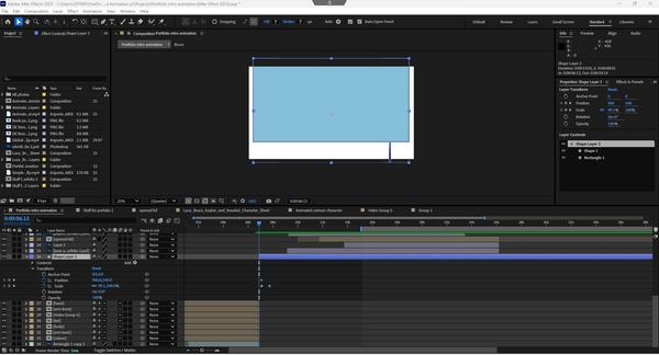

During the progression of the entire name intro, I had put some of the best characters that I had done so far, and deleted one original character for the sake of the space needed for the name intro itself. I was a bit mixed about how the characters and the side elements were positioned in this space of the display screen. So I deleted most of the keyframes to make replacements for better keyframes that I was adding back on After Effects.
It does improve on how I gave out for the animation on After Effects in a day, with some changes on how they move and how they were introduced with my actual name, with the same strategy as the introduction of the showreel animation. Adding how the text animation was changed a bit for a trim path outro, I had to make the whole text into a group of shapes and I had some conflict on the colouring of the entire outline to how I am going to change the text base colour to transparent with the outline with, but I'm just leave it there for the reasoning was too much for me to do today.

It felt like a huge thing to getting through with the entire overall changing for the positions for the elements and with the including with two results where I had to focused on was about that I had to put the current style I drew myself into at the start of the animations, where there were certainly different results of the name intro animation.
The whole thing was fun to be watch my name have such introduction with animation itself, despite it won't be the necessary for an animation introduction of my name, I could had done other things to introduce my name to others.
First result of Name intro animation
The first result of the animation was a bit experimental at best, as it had mostly done on the positions and timing of each frames that was done on the whole moment. This is fun to had some variable to exist before the final result where I had progress on the animation itself, there were some flawed mistakes in the animation itself, I liked how the result shows my name on a simple opening of the mail with some smaller elements at the side.
Second result of Name intro animation
This is a bit of a stretch for fixing some minor mistakes from the first animation I exported previously, the changes were the adjustments on the assets' movement timing and have the font changes since it is better to look at for the whole animation. Getting through with different part of the whole project itself.
Final result of Name intro animation
This is the final result of the animation where I had to change some smaller detail of the positions that having in the assets, there were some of the important moments where I had to put some in front of the introduction for easier to people to notice the changes the layout for the name intro. In any part, it felt easier for how some changes have to be get into within the introduction animation.
Final result of Name intro animation (channel name)
This is the sample of my channel's name "ArtvitoGrace", and since the font wasn't access on the Macbook and had to changed it into a different font for easier choice for popping out, the colour choice of purple have to collide with the colour of the paper was a bit of a stretch for me to exploring some other things in one animation.
It was fun to watch the name of my social media presences as part of the intro animation, it was simple to just give out hints from small things around me to easier discussions with different fandom or not get in touch with different media itself.
Collage
This is one of the small task about putting different cut out photos or drawings into Photoshop for later be edited into one single poster as for the promotion something from real life or somewhere fictional.
Idea
The idea of this collage poster is about a fictional city named Aelf Juliance (Pronoun: elf Ju-le-an-c), so it mainly based of the European castles and the city around it and it was used on the Dungeons & Dragon's fictional city and animation itself during the whole final major project in 2024. The entire poster design alone will be complicated to be done since there were needed to be a real photo as the references for the
Photo research

These photos were focused in the rural parts of the UK which had focused on the part where I put in the drawn part for the poster. Each part of the images had the nature part of it and it had seemingly fitting to the target of the theme of the poster which is nature and light fantasy.
Then the colour of green, badge and orange were fitting into the colour scem of the poster, which reflecting the light part of the theme itself and had the calm nature from the final result that I had done. Architecture itself was complex and short overall and it can be a bundle of it in a wide image itself.
-
Greiff-Gossen, E. (no date) Marksburg Castle, Englisch. Available at: http://www.loreley-info.com/eng/rhein-rhine/castles/marksburg.php (Accessed: 12 November 2025).
-
(No date) Been there, do this: Marksburg Castle in Braubach, Germany | travelage west. Available at: https://www.travelagewest.com/Travel/Europe/Been-There-Do-This-Marksburg-Castle-in-Braubach-Germany (Accessed: 12 November 2025).
-
The most beautiful village in england: How bibury became a victim of its charm (2025) The Guardian. Available at: https://www.theguardian.com/uk-news/2025/mar/30/the-most-beautiful-village-in-england-how-bibury-became-a-victim-of-its-charm (Accessed: 12 November 2025).
-
Cooper-Fiske, C. (2024) Beautiful tiny village with spectacular views named one of the UK’s prettiest, Express.co.uk. Available at: https://www.express.co.uk/news/uk/1874723/Beautiful-tiny-village-with-spectacular-views-named-one-of-the-UK-s-prettiest (Accessed: 12 November 2025).
Production

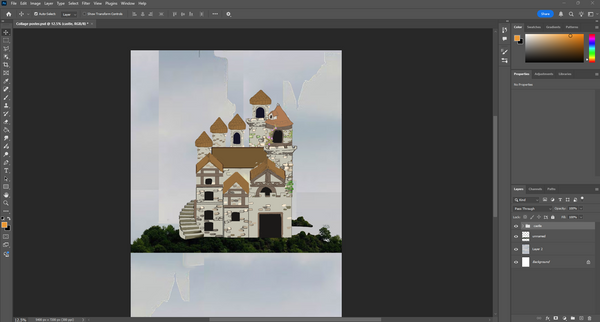
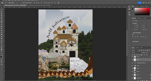
The production of the poster was a work load since I had to research some images and cut it into the background and the props at the side of the poster itself, as the castle was already done a few months ago so I put it in the entire grouped drawing into one part of the poster itself. I was planned the poster was be full on drawing collage poster of that fictional place, but I think of that, than changed to mix media of drawings and actual images cover it.
Each part was a bit of adjustments on the exact part of the images to fitting into the rural part of the world and had the natures and mountains that were in the entire part of the poster. Overall, it kept one part of the fantasy themed towards the poster itself, and each images felt like a cutout of different images and put together.
Results
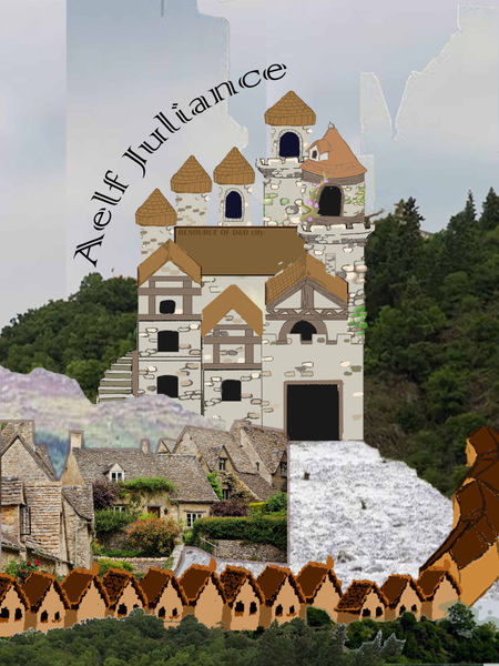

The results of them were mainly focused on the text font itself since the fonts can be effect the overlook of the collage poster itself to the target audiences. It was overall simple for the design at best since the mix media can be fitting into the entire poster with colours and the layouts of the poster for easy promoting places to the audiences. The overall was calming to me to dealing with the images in different part and had to edited it into become a mix media collage poster.
Best result
For two choice of the poster, this is the best one I had made on Photoshop, and with the only changes was the fonts of the text itself, the shapes of each elements in the poster was remained the same from the pervious result on the entire poster itself.
Live Brief
Poem book cover
Title is "Reflections", which is a poem that inspired by life and childhood growing up in India, it needed to be an A3 paper for the book cover itself, and was needed to be fitting into a simple yet had some complicating illustrations that had to be done on Procreate and Photoshop in a week.
Researches

I was thinking of a simple looking book cover with a small hint of more like a children's book targeted amongs young children about poems and encourage readings as much word as possible with imagery of the poem. There were two cover like "The Day I left"poem and "The Girl Who Loved Poem", the artstyles were simple to looked at from afar, and it was symbolic to the title of the poem and the book itself, the art style seems like hand painted and visually had the greatest of them.
-
The Day I left (poetry book) - Amazon.co (no date) Amazon.co.uk. Available at: https://www.amazon.co.uk/dp/B0CYSNJ1JB?psc=1&th=1&linkCode=gg2&tag=reedwebs-20 (Accessed: 25 November 2025).
-
Best poetry book cover examples & ideas (no date) Reedsy. Available at: https://reedsy.com/resources/book-covers/poetry/ (Accessed: 25 November 2025).
-
The girl who loved poems - by : Namita Gokhale (no date) DC book Online store. Available at: https://dcbookstore.com/books/the-girl-who-loved-poems (Accessed: 25 November 2025).
When dealing with texturing the poster, I had to find texture images from the website Unsplash. It helped me find some free texture images for overlays on clothing and other building textures, and it helped significantly at times when other small parts of the poster itself needed texture. The reason is that it's easy to find the correct texture to overlay on the colour I had done in different parts of Photoshop itself.
-
(No date) Fabric texture pictures - free images by UNSPLASH contributors. Available at: https://unsplash.com/s/photos/fabric-texture (Accessed: 27 November 2025).
Production

The outline of the entire poetry book cover design was completely laid out with thick pen sections to make it easier to map out all the essentials to be done in a day, and also laid out some background to save for later. It felt fast to make these in mind, I had done for the entire cover design, and the colours were the next important task that I had targeted on to do after the initial result of the base was done, and I did not change my mind.
I do this for the reason of being easier to focus on the character's positions first and worry about their outlook for later, within the colouring and outline of the cover art.

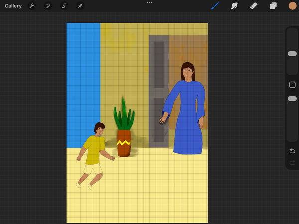
During the colouring and the outline on Procreate, I focused on the characters rather than the background since it was more important. I had some of the colouring techniques, such as filling it with the selecting tool, to make it easier for me to find out where I could outline the characters. Then I use the filling bucket tool after I finish the character outline. The progression was easy to get through the colours and lines, which is an easy task for me, but the more complicated part was the shading and the textures of the cover.
Yet I had other targets, like some sizes and positions of some small parts. It wasn't easy to say when outlining the characters after the overlay of the sketches, I had to adjust the hands and legs positions to match the physical contour of the objects. The shading of the colours was limited since I am in a rush to finish the project on Procreate, and I also wanted to add the shading after adding textures to the clothing in Photoshop.
As the most of the result of the project, I done most of the drawings on Procreate to easier the workload on Photoshop, there were mostly had the colours and the basic layouts of the book cover, yet had lack of the texture of the background and the characters to looked like hand-painted on a digital format. I felt I can't be gotten so far with the some rush with two project at ones and this one is done in this Friday at 28th of November.
I am felt glad that I had the time to do the project at home with Procreate to ease out the workload when back in college, there were many small things that needed to be edited on Photoshop and had some of the changes.
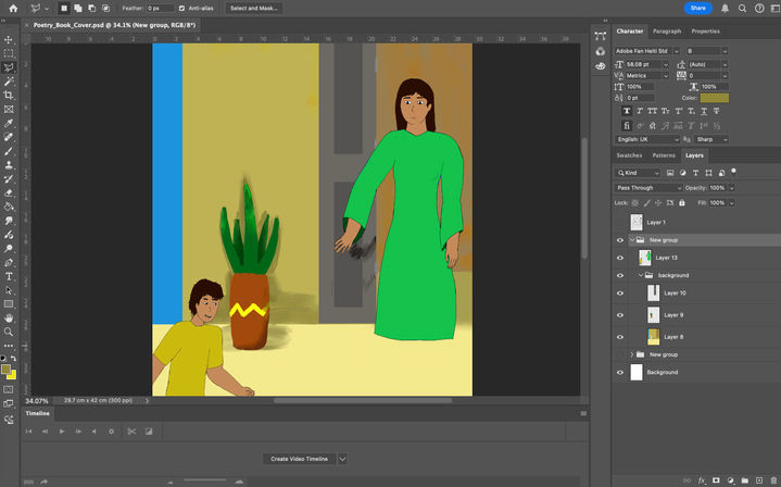
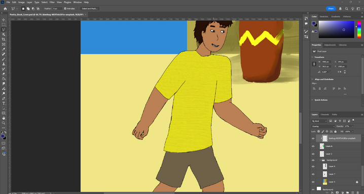

After I uploaded the whole project from Procreate to Photoshop, I focused on the texture of the clothes and background, also finishing off all the shadings and objects for different parts of the book cover. And also testing out the text that were placed at the corner of the cover design.
I was then getting the fabric texture online from the website, which was helpful for some clothes that were on the human characters, and isolated the human skin and the cloth texture. Then, I got through shading and changes in the colours to reflect the sun on different surfaces. I used dark blue colour for the shade, then a lighter colour for the light that hits the surface. Then there was the blending between some colours in the layers, so I used the smudge tool to smudge some part of the book cover so it looked great from far away from the book.
Results
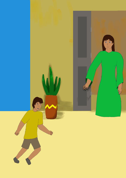
This is the first result of the project, it was simple and easy to read for the poetry cover, and there were a minimum of the character placements of how the kid was in front of the woman which had reminded her childhood in India, it had the smaller connections of how people can be reflected from others' similar experiences.


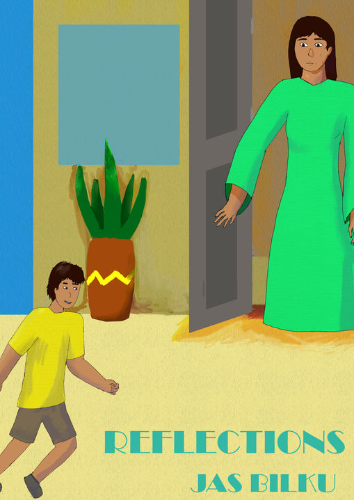
This is after dealing within Photoshop, there were a couple of changes on shadings, textures, and the positions of different layer, it left felt a bit more lively from the entire thing after given some of the textures and the shades of the poetry book cover, yet have give the simple of the cover without the complexity of the whole cover itself, it also helped with the limited colour of orange, green and blue, as it helped easy to navigates the message of how much impact between children and adult world in India, which adult had to reflect on their childhood of without worried much and carefree life.
There were need some certain testing for the fonts for match the vibe of the entire cover, so I had a couple of results for the poetry cover, at the first two of the results, I used the thin fonts for testing out which one is the best, but they are a bit simple to reading than I changed into the broadway font for better to looked at from far away.
Best result + Mockup

This is the best result I have had from Photoshop. The change in the text itself, shown at the corner of the poetry book cover, added to the font change, helping the poetry cover look good from the front.
At the same time, I felt it was perfect for being simple and clean to look at the cover; it also clarified how the adults and children were separated by age, yet had memories from the past or present, depending on the person. It was a great reminder of "Reflection" as the title suggested, and the meaning in the brief.
3D image in After Effects
It is a small task of dealing with photos made into a small slideshow animations of historical events, it can be every history happened in the past and had a couple of important events that happened that affect the entire industry or motivations.
Idea + Steps of do the 3D image
The idea of the 3D image was for an image of the first hand-drawn animation and the person who is behind the animation, there were a couple of information that needed to be researched on a couple of websites with images. Then I had to edited them on Photoshop for separated the people and the background and make into After Effects for had the 3D image animation effects.
Research

I do a simple research for the images and the information on the website of the first ever hand-drawn animation, the image was simple enough for edited out and also getting into four parts of the image. The image of the right was the one frame of the first traditional animation in history where a person riding a horse, the description was the animated film was made in 1908 and it was named "Fantasmagorie", it is a made by a French gut name Cohi.
Georgievska, M. (2017) The first fully animated film ever, the 1908 ‘fantasmagorie’ was made by émile Cohl: The vintage news, thevintagenews. Available at: https://www.thevintagenews.com/2016/12/06/the-first-fully-animated-film-ever-the-1908-fantasmagorie-was-made-by-emile-cohl/ (Accessed: 03 December 2025).
Progression

When the production of the 3D images, I had to made a separate between the characters and the background on Photoshop for easier to editing on After Effects. It was an easy process to cut out the needed part, but when I do the copy and paste the background with the stamp tool, it just copied the entire solid background from the stamp tool, so I'm just use the casual select and copy the solid parts of the background itself.
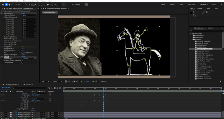

When animating two parts of a photo, I had a thought of animating the cartoon characters with pinpoints and rigging them within After Effects, which is located at the top bar, and I was curious to test out the pin tool to animate some part of the character. Then I cannot figure out where the 3D camera was, so I used the simple 3D effect to make things work, which was similar to letting the 2D image look like a 3D image. It is effective for getting off as a 3D image, animations and showcase. I exported it as a 10-second animation after that, and it felt a bit easier to get used to new effects on After Effects.

Then I found the 3D camera angle layer in After Effects after a day had finished the project, the reason was that I had to work with the 3D camera layer to test out the zoom in and out with different layers themselves without changing the size of the layers behind the 3D camera.
I am adjusting the photos back and forth to make it a bit more forward from the background; the background is also edited back and forth for a bit, since I can adjust them. So it was an experiment for me to test out the 3D camera layer with the adjustable things in After Effects. Resulting some real adjustments on the
Result
This is the original thing that I had done with the basic 3D image effects on After Effect, there were not much to talked about how the movements of the images on separated layer. The sliding effects for the basic 3D effect was great for me to be done on After Effect for experimenting stuff with animating.
This is the second result of the 3D image animation after finally take some researches online for how 3D image was done for the entire things by myself outside of collage, I had figured out how does the whole 3D camera layer worked with the layers behind it, as it is quite tricky to moved the images forth and back in seconds of the video.
This is the last animation of 3D image and it had some changes on how the positions of the images in After Effect, it had much better for me to be done on After Effect with some rotations and it's positions in the 3D image animation, it shows the layers between the background and the actual context of the animation.
Death Sprite (pixel animation)
It is a small pixel animation idea was done on Piskel which is a pixel animating website for all simple pixel gif, so I do the death sprite gif from teams provided, it was a simple proceed to animate the person in the most creative way to death.
Progression
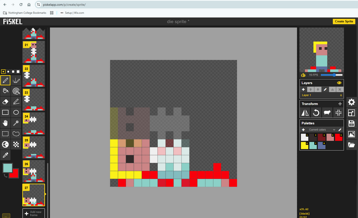
The whole process of the animation was a bit need to learn, from the basic control on the mouse to draw some important partices for the , and after there is no rotations when selection certain parts of the animation, so I got a bit creative for select the separated part then had to rotate the non selected part for easier to move the separated head and body, the art was simplistic from 16 x 16 pixels big animation, and it was the reason why the spine were set as cartoonish look.
Also there were parts of the animations were cut just to save some time from moving the head at the side and let it fallen down on the body, it also allow on the quick frame animations for had a great impact from the death animation.
Results
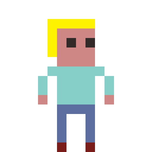

These were the result of the pixel animation of the death sprite, I had some inspirations for actual human anatomy when yank the head out of the body, it included the spine, yet had the cartoonish look with how the spine look since it is only appeared as in 16 by 16 pixel big animation.
Final result
The final result was having some delays for some of the frames in the pixel animation, I also adding back some blood on the body from the the head falling off after it was plugged off from the body, which was supposed to be better visually for the presenting the pixel animation. It was simple for me to getting through with the animation on the website that was free to be animated frame by frame and become a gif.
Example Portfolio

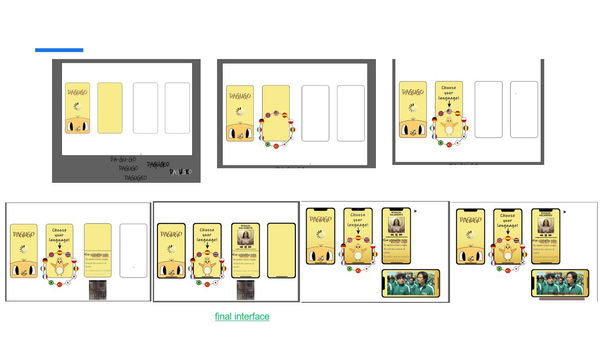

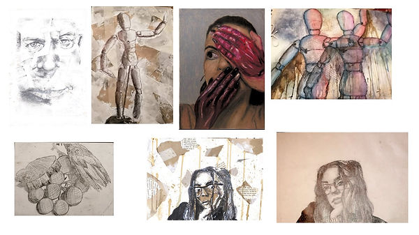
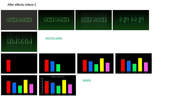
This is an example portfolio that I had got from Microsoft teams and I put as in my example presentations for mainly for the illustrations and productions of the animation. A couple lot of illustrations had done from different people with the progression of the sketches from traditionally and digitally.
Casual projects (porfolio)
There were a couple of casual projects that I had done during the free time from College, it mostly revolved around character design and poster illustrations for the festivals or video games. These were my best examples of my illustrations and designs that were put into the slideshow which had showed character sheets and posters I had done.
In total there were 26 slides of artwork, it can take up at least a few minutes to scroll to the bottom of the slideshow, and there were some notes of what kind of artwork I had done for the last 5 years, showing improvements on learning anatomy, clothing, colour theory, and appearances to make a great impression for the audiances.
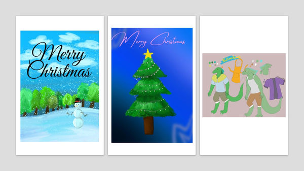

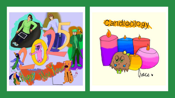
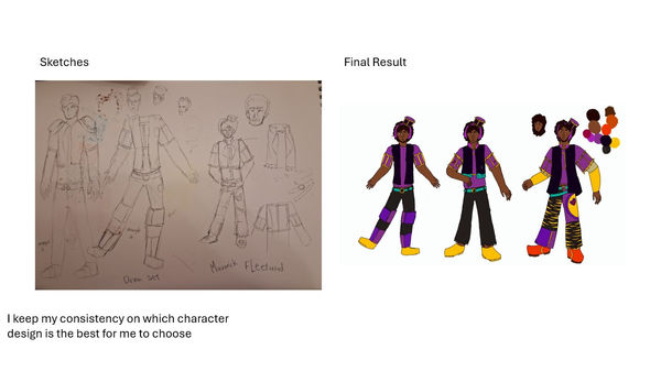


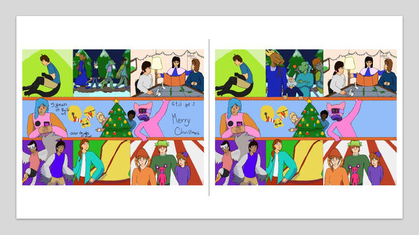


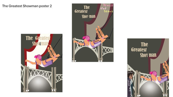
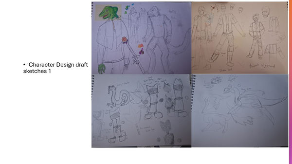
After all the slideshow of 26 pages of different results, the original sketches for the sheet and poster, it was worth to scroll for impress the people I gave the slideshow with multiple results of the artwork and design. Illustrations and digital art were one of my best for developed and learnt from 2021 in digital format and traditional format, it was a flexible on define my art style for constantly adapting on different famous styles on the internet.
Animation Portfolio
The animation portfolio was made through stitching together on one video to show which of the best animations I had done for the years, despite there were a couple of errors of the animation can improvise on everything from the last animations. Which having mush fun for making the animation by myself for personal use or main project usage.
As for most of the personal work was animated shorts on characters, or making an animatics. The whole portfolio was mostly from the project that I done in college. It was not a harsh time for me to finish a few seconds animation, it was
I also made the slideshow version for the animation for easy sharing if there was an interview involved online, which had been easier to talked about each animations I had done in the past and shared for the people.
Walk Cycle Animation (After Effect)
It is a walk cycle practice on After Effects, it was beside the walk cycle animation on Photoshop, but it was made on After Effects, there weren't be much differences on how the animation was done on each of the adobe software but it was fun for making rigged based animation beside hand-draw animation.

At the start of making the walk cycle animation for the person, I got the illustrator file from the tutor, I then string the assets together for sticking when togged along the body part; there were a lot of selections for getting specific layers together. The whole thing was a bit of challenge for finished in one hour despite it was the simplest task that an animation had got into on After Effects. It was mostly done with a mare of 30 minutes for that for a 2 second animations.
I was planning to make some puppeteer for some smaller details on the hairs and the hand, but the time had said so which was already short enough for me to done a simple walk cycle.

This is quite a while for getting thought with some errors every time I take a rotations of the connected joints, which some of the layers were connected wrongly, I had changes for the better movements for the character and just finished with the simplest movement without a second thought, I was thinking of adding some personality of the person but it was in a rush for finished the walk cycle at the end of the day and exported at one point.
It felt relief that some basic animation was done on After Effects, which helped me learned about the connections between layers and than tween for easier task and saving time.
Result
The result of the walk cycle was simple with After Effects despite there were a couple of mistakes that I can avoid and had changed on the real time for a quick animation. I am sure this wasn't the best, it had stayed in one area and had zero movement or personality of the character. I had thought of improvise the animation for the outside of college, for adding more on the characters on the walk cycle which reflecting a person.
Meme Art
It is a small part of designing that was referenced from the memes that were popular online, and I can draw a couple of meme art into characters I had designed over the years. It also require me to do a related meme art that I can found a couple of times.
Research
Researching for the exact meme and its origins were a bit of work to do, since most of the time memes spread around the internet and can loss the original of memes. So it was a meme hunt for meme searches. First thing was social media, it was most common place to posted any meme just for laughs for a few moments, adding some meme videos that were on YouTube or any short form videos, which can make into a short animations or a comic strips.
The last thing was a bit work around so I won't be working that a lot.
This meme was found on Tumblr, which it was made in 2016, this was the original post of the meme and had became famous from that, people had drew over this yet had no idea where is the original meme came from. I had the bare minimum for the idea of making the drawing out of this meme.
patientno7 (2016) My humor 2016 – @patientno7 on Tumblr, Tumblr. Available at: https://www.tumblr.com/patientno7/143233429212/my-humor-2016 (Accessed: 25 January 2026).
The video was from a scene from "Chicken Little" film where Chicken Little was far away from the bed, and the dad just frantically questions for "how did you get over there" and Chicken Little say "Over where?" in responds.
There will be a bit improvise for make into a 6 cell comic for a visual gag for how a character loss their balance and roamed around the room for something without an explanation. Then I screenshot of the bedroom for the base of the background and have the balanced out the
How’d You Get Over There? (video) (2024) YouTube. Available at: https://www.youtube.com/watch?v=cSv0JqPXxLk (Accessed: 25 January 2026).

This was a old meme that made in the 1970s, and it was from the Winnie the Pooh, it was a simple idea for how I felt when I looked at some of the old projects I had done, or some of the projects I had faced during college when I am retake my written work perviously when I am doing projects then changed it mid-doing.
So the plan was using my mascot as the base character and draw the same pose and the paper in front of them, it can recreate the scene for confusing situations that I am in the middle of the day.
Pooh squints at Paper Meme Maker (no date) Kapwing. Available at: https://www.kapwing.com/explore/pooh-squints-at-paper-meme-maker (Accessed: 25 January 2026).
Character I use
The most part of making a meme was using characters that I had made for the past 5 years, but the person is either me or my profile character for making the meme for easier to be made, it had the right moment to just reflecting their personality with the memes I can made through with them. I also can practice with different positions the characters.

Art Progress


The first of all was about the outline of the character, and I had to get the simplest shape and some accessories on the character, it was memorable for how I can draw the character like that since I draw them a lot of the time, then I colour the base colour I had selected from the palettes I had made for the characters.
Later for the shading, I first outline the character with hard shadows from the sketches, it makes the character easier to overlay from the outline that I applied later in the production of the reaction art that I had made. Then, I supposed to just had a simple shading and over cast light on the character, but I had added a bit texturing for the character to make them a bit like an old cartoon character.


The background was less complicated for the character I put in front of me, and it had some 2000s cartoon feels at the background to adding the wackiness for the character that were originally had. Then the texturing of the background was a bit of lacking for the finalising the art itself, had some sort of light hearted meme should had been needed.
A couple of additional details of fallen leaves and grasses were some brushes I could experience for the whole random situations that some of the cartoon character had encountered, it had some comedy charm for the art result.
Comic work process

For the small comic I am doing, I sketch the layout and the order of the comic, where the characters' outlines will be reused and redrawn in some columns. I refined the overall character, which was based on the background of the actual game, Date Everything, in the bedroom corner, where I got that through the playthrough I had watched on YouTube.
Then I got the sketches of the characters first, which was an easy task for me, but the consistency had made me a bit extended for the time to draw the comic into 2 weeks due to written work and more design work to do.

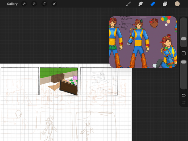

After duplicating the characters and rearranging them to my desired position in the comics, I made some adjustments to the characters' positions on the outlines, and the colours were easier to apply since they were already in place.
The human character was given a headband for simple recognition with shape, and it also resembled animal ears. I then selected the colours that existed and finished the missing colouring part of the spot. I then re-adjusted the first page after I duplicated the second page of the comic, a lot was easier when the characters were to be done on time, and I got the comic on time for personal update.
Result
Confuse mascot

This was a bit light hearted for me to make this under two hours with texturing and detail with the art as the meme, which can make a reaction for any confusing situations that were putting on.
Adding that the texture was great on the artwork, having the nice tint and mix of shading and lighting, make the artwork like an old cartoons shows or animated films for young audiences.
Comic
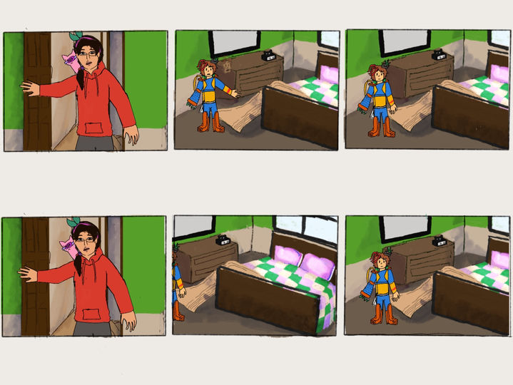

Finishing the comic was a relief, as I had completed it on time; the colours were just right, blending seamlessly between the backgrounds and the characters. Additionally, I'm just adjusting the columns into the right place and fitting them into the canvas I have on the tablet.
Overall, it contained a lot of fun things that were in the comic, making them had a personality and movements in the places around the time, also had the shading to make the background had depth from the characters. The colour on the characters were easier to regonised when done first and the outline make the whole scene like a simple comic in the 90s.
Additionally, it had me wonder how I am going to be done without the context, so I wrote it on the side and put it on the scale where everybody can read.
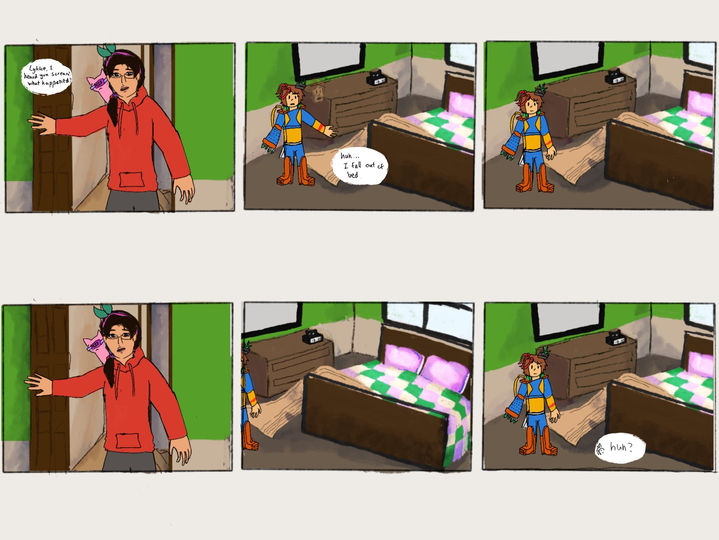

After I added the text in the columns, this makes the comic much easier to understand for people who watch the comic. The text was supposed to be half a column big, but I reconsidered and re-adjusted to the right size, where people can zoom in to read the text of the comic.
I liked how the white spot was easier to stick out the text, and it is also commonly used for illustrations, comics and manga. Which had isolated from the background and the text without the conflict of colours between the text colour and the background colour.
Overall, with the subtext, I found it a bit better for knowing the context of the comic, despite it being a short conversation in one animated film scene. It shows some depth of personality between characters and also tests out their adjustment.
I then made a slideshow out of the columns that I had drawn, and it was made on Photoshop, where I'm just setting all 12 of the drawings in the comic and zooming them to the right size for readability and the right position of the canvas.
It is just simple for me to stitch them together on a free video editing app like Splice, and I shorten each column, which simplifies the readability to the people; some attention spans were short, so it resulted in a 22-second-long video.
Media Jam Motion Graphic
This is a small project I had for the 2026 Media Jam logo introductions at March, so I had thinking of a bit of mixed media on the motion graphic animation, but in general, it was short 5 second to 10 second animation made on Procreate, Photoshop, and After Effects. It was also a simple task to be done by then.
The rebranding of the Jam Week logo was a bit of stretched from the start, I maybe need of a something that was similar to learning from the experts and getting changes, so the plant that gre
Ideas
The idea was simple, just had the introduction of the 2026 Media Jam, and it had lots of media course in the media building, I had thought of a simple 5 to 10 second animation should be done on After Effects and Photoshop. There were two different animations I wanted to produced; first one was about the typing out the letters and reveal that was a film shooting from the studio, the second one was about game designs and animations combined together as one whole motion graphics.
I will use Procreate for a bit of outline, but for the rest of assets were done on Photoshop and Illustrator for a vector assets on After Effects, After Effects was used for the animate and stitch all of the assets together.
Planning
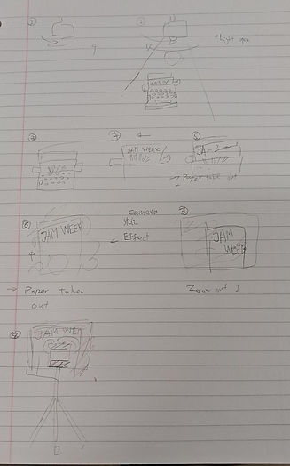
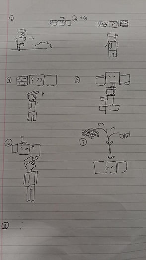
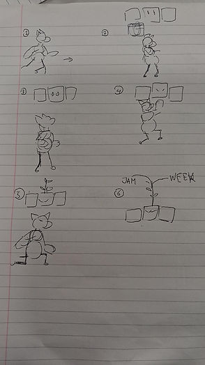
The planning for the production needed something around the media courses, which I had one idea for the typewriter at the start, then the camera at the end, this kind of animation can cover the journalism and TV course. I even thought of the Game Design course and the Digital Design and Animation course as one motion graphic animation in the storyboard, so I simply plan 6 to 8 panels for the motion graphics for the introduction.
I then final idea for the animation was put the otter in the original plan that I had with the typewriter, which can take me two to three weeks to finish a couple of results in one go.
Research


There were some important parts to finishing, including the creation of mixed media elements using photo bashing in Photoshop, making assets from actual products in Illustrator, and drawing on a tablet for a hand-drawn effect, all of which will be used in animations in After Effects.
Searching the background is important for the production, and it also makes things easier to be photo-bashed in Photoshop. The background texture I was thinking of was that of an old building, which tends to have some mould on the walls. And the website I was using is Freepik to find textures and buildings for references and photo bash, I had found one that was fitting the background and it is a free to download, so I downloaded it from Freepik.
-
Royal Classic Manual Metal Typewriter Machine with Storage Case, Red (no date) Walmart. Available at: https://www.walmart.com/ip/Royal-79120Q-Classic-Manual-Typewriter-Red/994230270 (Accessed: 22 January 2026).
Personal animation character
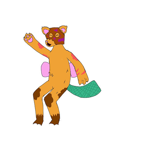
The character I was using was supposed to be an otter and a platypus, but I choose them to be an old cartoon style otter for the final result for easier to be animated in different format, from Photoshop or After Effects. I had think of other plans before putting the character in the original plan of the animation which I had to simply animated them at After Effects
Production

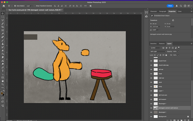
The first part of production for the Jam Week intro was having to done was about the assets for the animating, I done the character on Procreate first for animate the character frame by frame from the pencil tools in the app, and it was the original plan for making an animation the Jam Week. After I uploaded from Procreate to Photoshop for easier a hand-draw feeling of the animation character, I then separated the characters parts into different layers and named of which part of the character it is.
Then, I draw the simple stool with the pencil tool on Photoshop, it was a bit simple for overall and had a rejust the size when need to fitting the character on the stool, also with the canvas size of the character.
The background was changed into grey to fitting in some of the scenes that were use in some productions from people in media courses, adding with an effect that found on Freepik website, then photo bashed on the already existing colour that I put as the background of the animation.
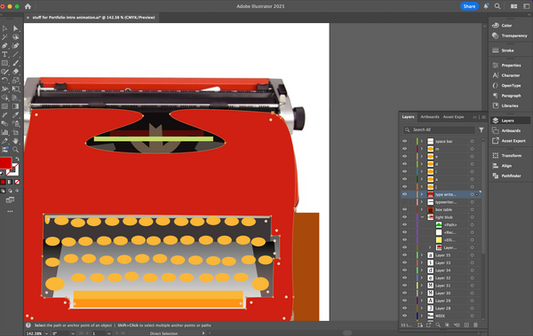

Then the smaller assets were made on Illustrator, I had thought design the type writer from scratch, but I ended up with referencing the actual type writer for guidance outline for the final result, then I select the colours from the typewriter since I need time for the animating on After Effects, also at the same time had the typewriter need to be actually move and typed out the word "JAM WEEK". It was great at first for finishing some small assets first till the made of After Effects.

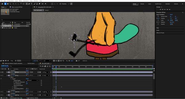
The first thing I animate on After Effects was about the character that I drew on Procreate and finalised on Photoshop, I was planned to animate them as rubber-hoe animation that done back then which save a lot of time for me to instead move the limbs and ankles bit by bit, yet had some problems for me to predict when doing as the final animation. So I'm sticking with mix animation from the rubber hoes and traditional tween animation on After Effects.
I also focused on the small details of animation when the character was moving from point a to point b, which mainly put the character body first from block by block animation, then improvise the animation bit by bit for the timing and clean up. The ears were also slightly animated for a bit when the head move, which a detail of how animal ears work.

Then, I added the smaller assets in After Effects, I was about put the light first since it was an animation needs to be done first; at the start, I only use the hanging light for a simple swing, but I feel it need to add more motion, which was the pin puppetry for the rope movements, it had additional movement of how windy and open the place is.
There were also some small adjustments for the animation, I readjust on the smaller parts of the animations, fixing any problems that were in different part, done mostly before add the typewriter.
The movement of the chair was added when I move the character, create some of the background animations that people can be notice at one point when watching animations from introductions or an episode.


The type writer was an additional for the whole animation besides character animations, it was a bit easier to be animate since I'm just focused on the typing animation with the letters come out accordingly. I also add the paper with the regtangle tool and pen tool located it between the typing machines. Then the letters were later been added and put them in order when each letters were typed out in the keyboard.
Overall, I got a bit into the simplest animation that were from the animation of the typewriter without knowing that the paper was dislocated without centre in the machine, but I'm just simply pass and think of the new animation idea for the motion graphic intro without this complicating adding the character.

For additional for that, I had added the character back with the same asset, I was make them face forward to the camera, so I make the move of the ears and mouth that were shift to the front of the camera, with the mouth that was added on the face the unsettling feeling of just eyes and ears, which the mouth was a different layer from the last one a few seconds ago, which I had created in the,
Also, I had to move the arm of the character, so I tested with the arms rotated and positioned it correctly in After Effects with the 3D image effects, it quite a job for me to finish the first edition animation of the media jam animation.

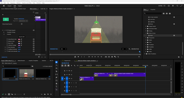
The new idea then proceed on the same file but different compositions of After Effects, I use the same rigged and the visual of the animations for finishing off, then I had the idea for make the intro and the outro like the TV, which I think Premiere Pro have the effect to put in the video.
So I imported the animation into Premiere Pro, I added the TV intro and the static effect into 30 for some simple effects for the video look straight from the 90s to 2000s TV. I also tried the cosset tape intro and outro for the video itself. Both of theses effects were quite interesting for the developing the
Testing animations
There were lots of testing animations that I can see which needs to be changed from time to time, mainly for movements of the character or some placements that needed to be done for the animation. It was fun for animating small moments and details on how the character contact can impacted the surrounding in After Effects, which was a bit more of a work.
This is the only tested animation I have made for the media jam motion graphics. I initially tested the main movement, including the body and lights, but overall, it was most effectively displayed in the characters' motions, where I can make further improvements in the editing process in After Effects.
The animation style was mixed between a traditionally animated character, and then there was a puppeteer animating on the lamp, and digitally on the typewriter.
The animation change I needed was to finish what I had left from the motion graphics and add the typewriter for the final typing out of the word "Media Jam".
Animation results
The first result was achieved after I added the typewriter following the first test of the animations, which gave me the confidence to finish the animation on time. It was completed with the animations within the character animations that I had planned, and I had good rhyme timing for the animation, which doesn't seem rushed.
I also focused on the introductions of the media jam that needed to be typed out from the animation, so I got the work done for each letter on the keyboard that was pressed on the typewriter. It makes it easier at the end as quickly as possible.
Version two of the animation fixed the issue that I had with the version one animation, adding more of the animation to the characters and some smaller animations that were in effected by the movement, which had more obvious background effect and taken things slow for to looked at when watching the animation.
Overall, it focused on changing in animation pacing and had a lot of them worked in just an hour of fixing the pin point of the animations, also it had focused on the animation that I had for the character. It felt satisfied when finished up the animations with the character, but next time, I'm focused on the typewriter.
Version 3 was only for the typewriter animation, reusing the same assets as from the pervious versions I had made, it felt a bit better when there is nothing much to looked at, it felt the sense that I had made for the important part of the animations which focused on one thing as simple as a typewriter. I also animated only the lights to flicker to open for show the scenery, which had the mirror on the commonly used stuff on warehouse scene.
It felt a bit easier to just reusing some animations to shorten the times in result, and it also helped me for a bit more ideas for the video editing in the animations which was on a different adobe app.
These were the two results from the result 3 after the editing, which was depending on the intro and outro of the animation, a TV intro and a VHS tape intro, which had a lot of thinking to be done for the animations editing besides making them on After Effects, it felt different from each time I see two different intro that can effect the atmosphere for the animation.
It was much fun to experimenting with the different effects that I can put on the video, it creates mainly for the small screen scene for the video, it was a simple video to be done on time.
Final result
Version four was the final result I had done for the animation, it had just fixing the lighting of the animation and centre the typewrite to the middle of the video to fixed the problem of putting the typewriter to forward. Overall it was a quick editing of the animations, despite there was a plan for the editing but there were some imbalance of working and also take a break off from animating for a while. It was fun to make these animation and had the testing different result of the animation.
Best result
I choose this animation as the best result since it had mainly for the introduction of the TV screen, adding the static effect with the colourful dots and statics, it build a bit of a personality for the animations.
Evaluation
For the start of the small animation for Jam Week only made in a few weeks, I had to maintain the simple introduction for the jam week despite there were a lot of the idea brain storm, it had me a lot of the time for drawing the character and design the type writer first before draw the storyboard on the note sheet I got. I then had to design and animate the things that I had planned for.
Then, I put into the production for finalising the character design first, I was planned to animate the character on Procreate frame by frame but changed my mind for animating on After Effects for saving time, also having fun for the testing for the animating a character for a full 5 second animation. I also finish the assets on Illustrator for easier to be done, also gotten the time for the import on After Effects. At least I could had update the website at the same time in the 2 week gap when I got to do other projects and evaluations.
Then, the assets were uploaded on After Effects composition and start the animating on the time. It took me a lot for a simple adjustments for how the character was moved, editing the right position and the anchor point, took me 2 week to finish the first couple of results that were quite fun to watch; suddenly , I had the idea for the original animation I could had done, so I duplicate the composition and had the time to edited the time and pacing of the animation, I also got the light animation for flickering.
The end results were greatly produced, which had a lot of different perspective that I got in the animation, have different effects that were applied on different results, it was a relief even it was a two week project I can done on time. Overall, it help me have the skill of the creative solving, animation, adobe softwares, and character design.
Design details
There are a lot of the design detail from every general stuff that was around the place, which I sometimes overlooked the design when look around in my house. Which had a lot of discussion for the important detail for different parts in buildings and the
